A logo serves as the primary means of interaction with your audience; therefore, it should include visual and textual elements. We recommend a combined logo for your company.
A combination logo is a blend of both logomark and logotype. It helps the brand attract a broad audience and subtly informs what it is about.
In this article, we will review the kinds of combination logos, different combination logo designs, and how to use combination logos.
What is a Logomark?
A logomark is an image or symbol used to elevate a brand’s identity. Symbols are often associated with brands to make them memorable and unique.
If you have a problematic brand name or are aiming for a global market, a logo mark is the best choice because it adds a creative touch to your logo and makes it more impressive.
What is a Logotype?
A logotype is a typographical representation of your brand’s name. It makes your brand more recognizable, simple, and easy to find and establishes visual memory.
There are different ways of using logotypes,
1. Capitalize the whole name.
2. Capitalize the first letters.
3. No capital letters.
What Makes Combination Logo Designs Most Relevant?
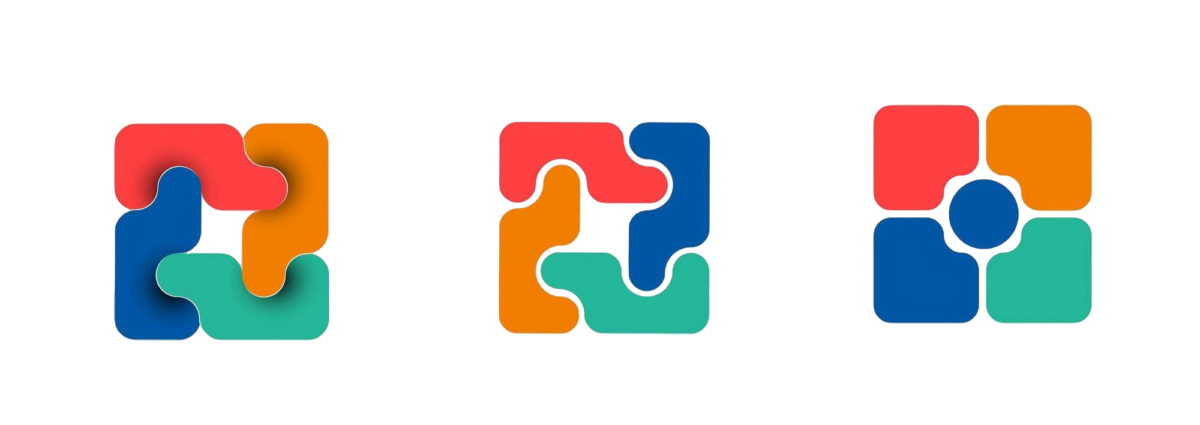
A combination logo combines logotype and logomark and thus acquires both qualities. It is the best because it creates a visual display and a memory.
The text in the combination logo makes it legible, and the icon or image makes it more attractive and attention-grabbing.
Combination logos are best for brands because they give the audience a clear notion of the brand. Together, they make a logo more graphically appealing and visually relevant.
There are two main types of combination logos.
1. Tight Visual Designs
In this design, the text and graphics are tightly integrated, which makes them too close to each other and elevates their visual appearance by their unique style.
This design is restricted because it needs more flexibility and legibility. Also, a tight visual design is hard to scale because all its elements are tangled.
2. Loose Visual Designs
In this design, the elements of the combination logo are loosely placed within the design, making it easy to create, super flexible, and easy to apply.
But this design could be more exciting to look at. It is not unique or widespread, and it could be more exciting.
Let’s discuss the benefits of a combination logo design.
Versatility
A combination logo is more versatile and addresses multiple issues concerning logo design. In combination with logos, we see three main types of logo layouts.
Horizontal Combination Logo Layout
In this layout, the icon is located horizontally to the typography, either to the right or to the left. This layout works best if the logo is long or complex.
This layout makes your combination logo design more aesthetically pleasing and soothing to the eyes. A famous example of such a logo is Freelancer.com.
Staked Combination Logo Layout
A staked logo layout is also called a vertical combination logo layout. The image or icon is located vertically in this layout to the primary typography. It is used to make logos more alluring.
This works effectively when the typography is short; otherwise, the logo will be busy and cluttered. A famous example of such logo design is Red Bull.
Integrated Combination Logo Layout
In this layout, the typography is included within the image or icon. This layout is more engaging, fun, and impressive because it sets the logo apart.
However, the biggest downside of such a logo is its need to be more versatile. You can’t exclude the text from the image or the image from the text. Both should be used together or not at all.
The most significant upside of this layout is that it enthralls a larger audience and helps to draw more eyes to the logo. The best example of such a logo is Doritos.
Memorability
A combination logo helps build a brand legacy by displaying creative visuals that keep the audience hooked and build fondness over time.
Because a combination logo combines logotype and logomark, it is more vocal to the audience, connects a broad spectrum of audiences, and leaves a cognitive footprint in their minds.
Brand Recognition
An excellent name or slogan and an engaging image can skyrocket your brand’s visibility like nothing else because the logo already contains everything the audience needs to know about it.
The logo truly depicts what the brand is about and what services it provides. Everything is in the logo, so the audience doesn’t have to look elsewhere.
Differentiation
A good logo combination makes your brand stand out in business. It provides the customer with both visual and aesthetic elements of your brand.
It helps you connect with your customers and impacts them emotionally. It makes your logo easier to experiment with and creates visual harmony.
Professionalism
A well-designed combination logo shows your commitment to the brand and helps strengthen your brand identity. A logo helps build loyalty among customers and the brand.
The combination logo is a branding toolkit because it has all the elements to keep your audience flowing toward your brand.
A 5-Step Guide to Creating an Ultimate Combination Logo
Let’s look at the steps to designing an ultimate combination log, which is the key to branding your business.
1. Learn and research the current trends and learn the color theory and your targeted audience to know what will work with your logo and what will not.
2. Choose the reliable layout for your combination logo and choose the symbols and fonts for your logo.
3. Test your logo and see if it looks good in greyscale, if it’s tilted, or if it’s scalable. If all these conditions are met, your logo is ready.
4. But before you upload it to your business account, it’s crucial to ask for logo design feedback so you know what the audience thinks about the logo and how they perceive it.
5. Now, your logo is ready. You can upload it, but remember to create hype about it. Make people curious, reveal it in pieces, and make a big deal about the logo reveal.
FAQs:
Q1: Is a combination logo combining two logos?
Ans: No, a combination logo combines an image/ icon and text.
Q2: How is a combination logo better than other types of logos?
Ans: Combination has both the visual hierarchy and the knowledge that makes it better than other logos.
Q3: Is designing a combination logo complex as compared to other logos?
Ans: A combination logo is not hard to design, but you must consider more aspects of creating it than others. That’s why we suggest you hire an expert.
Conclusion
A combination is a combination of icons, images, and text that boosts the optical balance.
The text in the logo makes it legible, while the image makes it aesthetically pleasing.
Combination logo designs have a lot of potential if used properly because they are transparent, authentic, and memorable to viewers.
A combination logo is recommended to small business owners because it will make their brand more visible, and the image will inform the audience about the brand.
Hiring a professional for logo designing is advised because the logo is the focal point of your brand and needs to be the perfect element of your business.
Explore Further:
Vince Logo Design is a distinguished digital marketing agency, specializing in crafting compelling brand identities and optimizing online presence. We are your partners in creating impactful digital strategies that drive results.
Get in touch.Articles
- Top 10 SEO Benefits of Responsive Web Design in 2025
- 8 Best CMS for Small Business in 2025: Pick the Popular
- 5 Best Hosting for Small Business Websites
- Affordable WordPress Website Design: Best Service Provider
- Custom Design Vs Template Website: Which One Is Best?
- Fix My WordPress Site: WSOD, Redirect & Site Maintenance
Get Free Consultancy
Fill the following form and receive a guaranteed response within 48 hours.


We have worked with world's leading brands