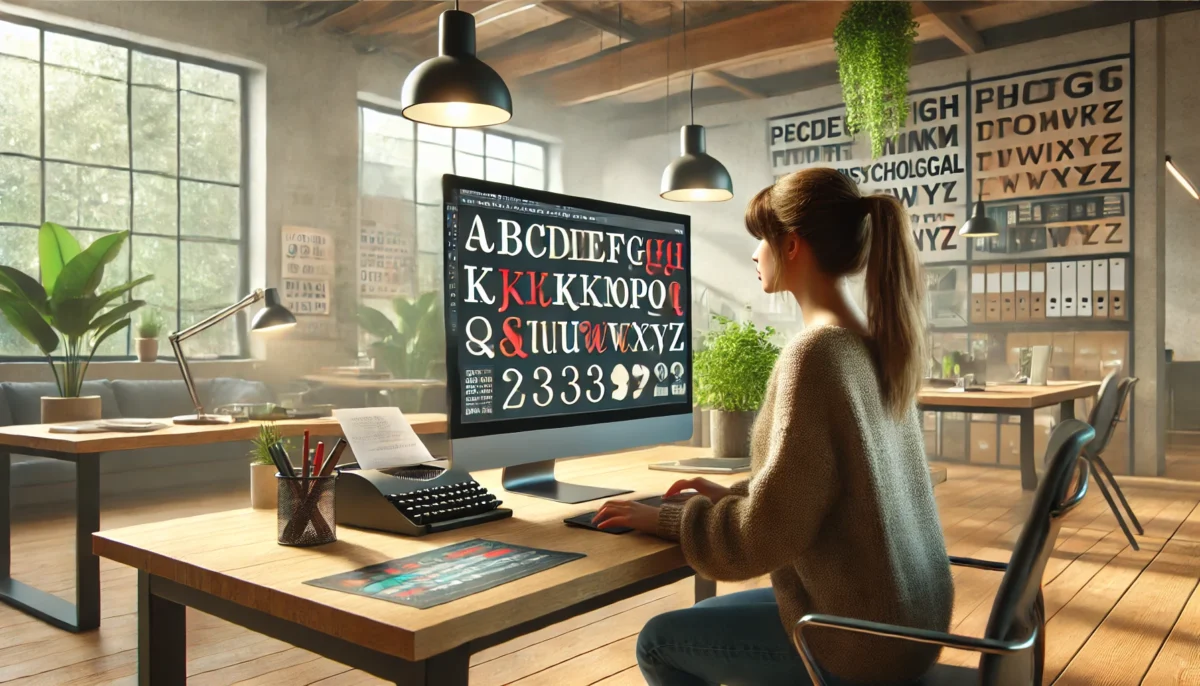
Designing a logo is demanding because you have to take care of many aspects of designing like colors, shapes, elements, and most importantly fonts.
The right way to select the best fonts for logos is by taking inspiration, synchronizing emotions, and understanding your brand’s morals and messages.
In this blog, we will explore business logo fonts, what they resonate and how to choose the best font for your brand.
Why Is Font Important For Business Logo?
By choosing the accurate font for your business logo, you can enhance your brand identity, connect with your audience, and deliver your message more clearly.
Different fonts cause different emotions that can help you captivate your audience and target the right market.
With the right fonts, you can showcase what your brand is about and how you want your audience to perceive it.
Let’s look at the most used business logo fonts and understand their significance. The basic function of your logo is to develop your brand’s identity.
Most Used Typefaces For Business Logo
Different fonts are used to describe the tone of the business and to create a visual hierarchy.
1. Serif
Serif font is used to convey the message of respect and trust. It shows heritage and class. It has small lines or strokes attached at the end of every letter.
Serifs are used to show more of a formal and traditional tone and are used in newspapers and magazines. Many luxurious brands use Serifs to show authority and authenticity.
2. Sans-Serif
Sans-serif font is used to show the straightforward nature of the brand. It shows the minimalism and simplicity of the brand. It doesn’t have a serif (strokes) at the end of the letters.
Sans-serifs are considered bold, modern, and catchy with their sleek design. Most brands lean towards sans-serif because of its cutting-edge design and futuristic look that makes it easy to pair.
3. Slab Serif
The slab serif font is used to convey a voice of confidence, creativity, and dependability. It shows the sense of importance and need. It is a subset of serifs with distinctive bold features that make them look like slabs.
4. Script
Script font is used to show style, elegance, freedom, and femininity. Script fonts are handwritten and more fancy. The blocky look of the script font makes it more natural.
The strokes depict style and provide the idea of creativity. Many brands use handwritten fonts to show authenticity, friendliness, and playfulness along with elegance.
But many also avoid using Script fonts because they are less professional and are considered unserious.
5. Decorative
Decorative fonts are used to show originality and creativity. They are also called display fonts because they are unique and appealing. They are preferred by the brand because they show character and authority.
Choosing the right business logo font is very important for your business because it helps you to portray your business.
Most Used Font For A Business Logo
Here is the list of the 15 most used fonts in the business logo.
- Helvetica
- Avenir
- Proxima Nova
- Bodoni
- Futura
- Open Sans
- Variane Script
- Baskerville
- Gill Sans
- Garamond
- GT America
- Agentur
- Canela
- Didot
- Roboto Slab
5 Key Points For Choosing a Font For a Business Logo
The logo is your brand identity and the font used in your business logo is the primary element through which you can engage your audience.
Let’s understand the key points that could help us to choose the best font for your logo.
1. Scalability
Your font should be easy to scale so it looks well on small as well as large canvas. When your logo is scaled it will look proper and versatile and could be used on different platforms.
2. Legibility
Your font should be easy to read otherwise it will dormant the whole purpose of having a logo in the first place. Using fancy fonts might help make your logo look ornamental but not readable.
3. Contrasting
You might have heard about color contrast but there is also a contrast between fonts. Different fonts bring out the best in other fonts and enhance their appearance.
4. Minimalism
Your font should be minimal otherwise it will disturb the look of your logo by making it more bulky and congested. It is better to use the simple and subtle fonts for your logo.
5. Complementing
Your font should compliment your color scheme and look good with the colors used in the logo but it should also look proper and suitable in black and white.
You can explore different types of logos and then decide which fonts will go with that particular logo and are good for your business.
Font Psychology
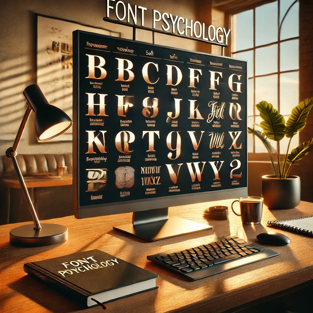
Different fonts emerge with different emotions. Many businesses use font psychology and combine color psychology with it to their benefit to boost their business.
If you want to show elegance and sophistication, you should use fonts with thin strokes because they display luxury, refinement, and exclusiveness.
If you want to have fun and playfulness, you can use display and decorative fonts because they show a whimsical and informal tone.
If you want to show friendliness and warmth, you can use rounded and soft fonts because they show warmth, approachability, and friendliness and it helps you to connect with your audience.
If you want to show power and strength, you can use bold fonts to show assertiveness and stability. They are used to command attention and have an emphasized impact.
Final Determination
Choosing fonts for business logos is a daunting task because your font is the focal point of your brand and is the topic of attraction for the audience.
Fonts for business logos are mostly elegant and serious but lack empathy and friendliness which makes them lose the audience and end up making the business less memorable.
That’s why you should analyze the tone of your brand and choose the font according to that to elevate your business.
If it’s still hard for you then the best option for you is to hire a professional so you can focus on your business without worrying about the logo or their fonts.
Explore Further:
Vince Logo Design is a distinguished digital marketing agency, specializing in crafting compelling brand identities and optimizing online presence. We are your partners in creating impactful digital strategies that drive results.
Get in touch.Articles
- Top 10 SEO Benefits of Responsive Web Design in 2025
- 8 Best CMS for Small Business in 2025: Pick the Popular
- 5 Best Hosting for Small Business Websites
- Affordable WordPress Website Design: Best Service Provider
- Custom Design Vs Template Website: Which One Is Best?
- Fix My WordPress Site: WSOD, Redirect & Site Maintenance
Get Free Consultancy
Fill the following form and receive a guaranteed response within 48 hours.


We have worked with world's leading brands