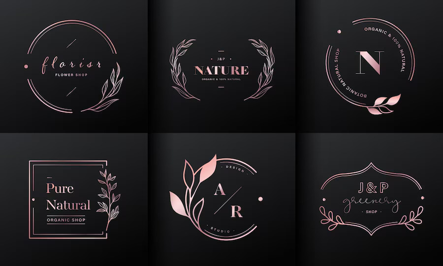
If you are looking for ways to establish brand authority with the touch of personalization, then the monogram logo is the perfect solution.
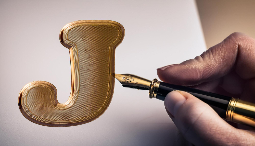
A monogram logo combines two to three letters designed together to create a simplistic, sophisticated, and timeless design.
In this blog, you will learn what a monogram logo is, its definition, and its example.
What is a Monogram Logo? A Brief Outline
The Monogram logo is a letter mark entirely made up of typography. It comprises two to three letters. Some brands opt for a single-letter monogram logo, too.
Monograms are visually appealing and speak values that make them memorable, clean, crisp, and classy. They are also considered decorative designs as the fusion of letters gives off the symbol’s look.
Monograms often represent the initials of the business. They are designed to create imagery to further illustrate the brand concept. The key to a perfect monogram logo is brand values and brand position.
Monogram logos are used widely because of their simplicity and sentimental value. These logo designs convey a brand’s entire narrative with a few strokes. They emphasize the name and positioning of the brand they represent, fostering a strong connection between the audience and the brand.
Because the monogram emphasizes the letters strongly, the fonts and colors used in the logo play a crucial part in the monogram logo.
Tips To Help You Choose Monogram Logo Designs
Choosing an ideal monogram logo can skyrocket your brand value, visibility, and personality. However, it’s advised to keep in mind that by incorporating these tips in your monogram logo, you can design a perfect logo.
Explore Different Typefaces
Different fonts represent different tones. By understanding the differences and significance of different typefaces, you can choose the best font for your logo design. You can explore typefaces by researching competitors, your industry, and the logo’s shape.
If you are looking for the best fonts for business, read our article: How to Choose the Best Font for Your Company? (Guide) to get a better idea.
Color your Brand Represent
Since the monogram logo usually has only two letters, it leaves plenty of space for colors. Using authentic and accurate color in your logo design is a vital step.
A concept like color psychology can help you understand the significance of different colors. It also helps you identify the perfect color for your logo design.
Play With Layout
Placing two letters side by side and calling it a monogram logo might be used to work for certain brands. But with the revolutionary changes and fast-paced media presence, it’s hard to capture someone’s attention.
That’s why it is suggested that you experiment with the layout and try different angles, shapes, and formats to engage your audience. A generic logo does not work nowadays. You need to think out of the box.
Utilize Negative Space
Negative space in logo design is a treasure for those who know how to utilize it. You can design your logo to use all the negative space and deliver a cohesive monogram design.
Create Hidden Meanings
Who doesn’t love a puzzle? A little mystery or hidden meaning can intrigue your audience and make them spend more time on your logo design.
Types of Monogram Logo
In this section, we will discuss some of the famous designs of monogram logos.
- Initial Style: It comprises one letter with the company’s initial.
- The Block: It consists of three letters.
- The Traditional: It also consists of three letters; the middle letter represents the last name.
- The Stacked: It is also a three-letter monogram. The first and middle initials are stacked on top of each other.
- The Interlocking: It is used for the fonts that have flourishes.
- The Circle: It is a two-letter monogram, sometimes also three. The characters are placed inside a circle and are positioned to take the shape of a circle.
- The Diamond: The mechanism is similar to that of a circle; however, in this one, the characters are placed to take the shape of a diamond.
- The Split Letters: It has small spaces overlapping the initial characters. Those spaces contain complete words of initial.
When Should I Opt for a Monogram Logo?
A Monogram logo is a great design that is not suitable for everyone. You must perform in-depth research to ensure the monogram logo works in your industry. This blog section will discuss which businesses should go for a monogram logo.
Family Businesses
Joining initials associated with the family helps foster a deep connection between the customer and the business because customers consider themselves a part of a big family. It helps build brand loyalty, value, and positioning.
A monogram logo represents the physical and emotional union of the names. The famous brand Gucci has a monogram logo with two Gs for Guccio Gucci, showing its family roots.
Luxury Brands
The history of monograms has roots in the royal family, the Victorian era, and ancient civilization, which gives the monogram logo an authority of luxury. Most famous luxury brands, such as Louis Vuitton, have monogram logos. That’s why most reputed hotels have monogrammed accessories for high-end clientele.
Wordy Brands
Many brands have long, complicated names that are hard to pronounce. A monogram can easily shorten these names without sacrificing brand equity. The most famous example is CNN, the Cable News Network abbreviation.
International Brand
The international brand has to deal with language barriers, cultural variations, and style distinctions. By combating these barriers, the monogram logo helps boost brands’ visibility in the international market. The most known example is H&M, a simple fusion of two letters that doesn’t offend any culture or language.
Key Takeaways
The basic definition of a monogram logo design is that they are a fusion of two or three letters that are the brand’s initials. They depict strong and impactful representations of brand personality and values by boosting the brand’s sophistication.
There is no logo vs. monogram because the monogram itself is a logo design. The font, color, layout, shapes, and negative space impact the monogram logo. Famous examples of monogram logos are Gucci, LV, LG, CNN, GE, and HP.
Logos are crucial parts of branding and the primary identity of the brand. If you need help with branding, contact us and leave your branding hassles to us!
Explore More:
Vince Logo Design is a distinguished digital marketing agency, specializing in crafting compelling brand identities and optimizing online presence. We are your partners in creating impactful digital strategies that drive results.
Get in touch.Articles
- Top 10 SEO Benefits of Responsive Web Design in 2025
- 8 Best CMS for Small Business in 2025: Pick the Popular
- 5 Best Hosting for Small Business Websites
- Affordable WordPress Website Design: Best Service Provider
- Custom Design Vs Template Website: Which One Is Best?
- Fix My WordPress Site: WSOD, Redirect & Site Maintenance
Get Free Consultancy
Fill the following form and receive a guaranteed response within 48 hours.


We have worked with world's leading brands