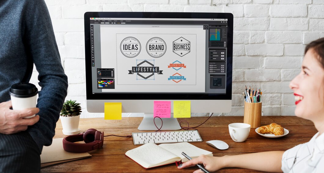
The logo is your primary impression, your brand’s face, and most importantly, your brand’s voice. It is more than essential that your logo conveys the proper signal.
Here are the dos and don’ts of logo design that you should keep in mind.
Your logo should embody your brand’s values, develop trust among the brand and audience, and portray the significance of your brand without wordiness.
In this article, you will understand what not to do when creating a logo, what to do when creating a logo, and how to design rules.
15 Do’s And Don’ts Of Logo Design
Make sure you keep all of these attributes in your mind while creating a logo design.
1. Research And Refine Your Audience

Do’s: Keep your audience in mind while designing a logo design. Perform deep research to know your target audience, where they are from, and their interests.
The key to an impressive logo design is extensive research to know about your audience, your competition, your industry, and, in particular, what people will spend time on.
Exploring your competitor’s sites will provide you with relevant insights about your audience and their interests.
Don’t: Don’t impose your branding onto them. Never design a non-relevant logo that doesn’t intrigue your audience and attract their attention.
If you think you can just create a logo of your own choice, ignorant of the audience’s perspective, then you are silly because your audience is not limited to you; if you do not attract them, they will go to someone else.
So, the key to being relevant is to listen to your audience’s perspectives, opinions, and comments.
2. Inspiration For Logo Design
Do’s: Before you go ahead and start designing your logo, make sure you have an inspiration board near you. An inspiration board is very helpful and handy while designing a logo.
An inspiration board states your motivations, goals, targets, relevancy, and prototypes of the logo design.
Your inspiration board should have a hand-drawn version of your logo, your brand’s value that you want to portray through the logo, your competitions, and what you must like in your logo.
Don’t: Don’t replicate your competition’s logo. Take inspiration from them, collect different elements that intrigue you from different logos but don’t copy-paste them.
Don’t use downloadable designs on the web and clipart, and also try to prevent photographs in the logo.
3. Keep Your Logo Legible
Do’s: Keep your logo clear, crisp, and concise. By that, we don’t mean to put on a basic logo and make it eye-catching but clear enough that the audience can understand it.
Don’t: Don’t make it too crazy, like it’s full of different and inessential elements. Over-designing and elements can make your logo look childish.
4. K.I.S.S (Keep It Stupid, Simple)
Do’s: Keep your logo simple, basic, and to the point. Your audience has merely a few minutes to look at your logo so make sure that your logo is easy to understand.
Learn the top 7 elements to create a professional logo design.
Don’t: We understand your urge to decorate your logo with different patterns, fonts, colors, and elements, but that will make your logo extremely unprofessional and unserious.
5. Color Psychology of Logo
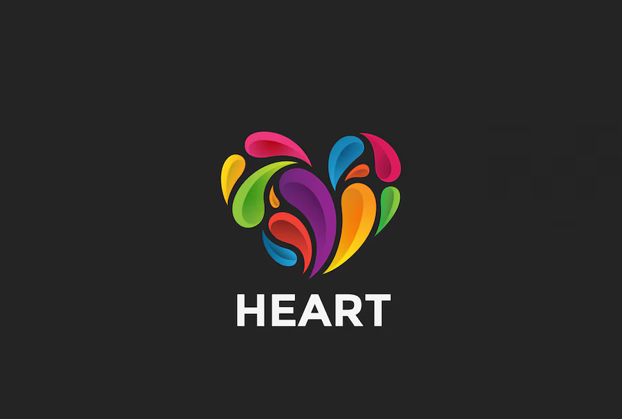
Do’s: Adding colors to your logo gives it an emotional and inspirational touch; you can try different hues or understand color psychology to learn better about the color significance in your logo.
Don’t: When we ask you to colorize the logo, we don’t ask you to make it a rainbow. Make sure to add nonsignificant and unnecessary coloring to your logo. It will take the authority out of it.
6. Scale Your Logo
Do’s: Scaling your logo gives you an idea of what your logo will look like. Your logo must look reasonable. That’s why scaling your logo is essential for you.
Don’t: Your logo is going to be used on different platforms and in various ways, like banners, on your product, on social media, and most crucially, on your website.
If your logo is not adapted to different patterns or isn’t scaled, it will look unfit and clumsy, which can downgrade your brand’s authenticity.
7. Make Your Logo Versatile
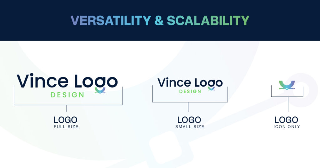
Do’s: Make your logo versatile. So it can engage different audiences, interest other people, and look good in every environment.
You should have a vertical, horizontal, and square version of your logo to make it versatile for every measurement.
A little helpful tip is to change your logo colour to black and white to see if it still looks good; if it is, then your logo is suited for everywhere, and you can advertise it. Make it colorful again.
Don’t: Sticking to one type of logo can ruin your appearance. If you use a horizontal logo in place or a vertical or square-shaped logo then it will look distasteful.
8. Use Of Typography

Do’s: Fonts tend to either make or break your logo. A combination of 2 fonts sounds amazing because more fonts than that look crowded.
Your font should be feasible and legible and should be easy to read in different sizes. Also, save your design in vector format for easy sizing to avoid pixilation.
Don’t: Using too many fonts will make your logo look busy and buzzy. It will be tiring to the eyes of the user and hard to be versatile.
9. Keep Upgrading Your Logo
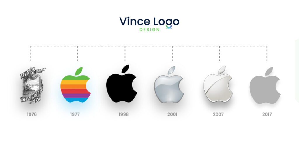
Do’s: By constantly updating your logo design, you will keep your audience hooked and interested; you can plan big logo reveal events and keep the audience engaged.
This is a great way to keep your legacy and build a family. This is also a great way to remind your audience that your brand is still there and is progressing to be better.
Don’t: Changing the logo too often is not a sane thing to do because it will take away the significance of your brand. You should change after every 10 years or some.
Keep your logo overall the same. Be consistent with your logo, but keep making minute changes to it to make it more trendy and up-to-date.
10. Don’t Waste The White Space
Do’s: Be mindful of the white spaces in your logo. Don’t waste the negative space or white space beside your logo; instead, use it in the logo effectively.
Don’t: If it is not working for your logo, then you can avoid it because you have to make your logo eyes- candy.
11. Make Variations Of Your Logo
Do’s: While making your logo, make different variations of your logo and use different color schemes and different fonts so you have many options to select from so you make informed decisions.
Don’t Use different types of logos on other platforms. You can differ in size but not the design or color scheme that will fade your brand’s originality.
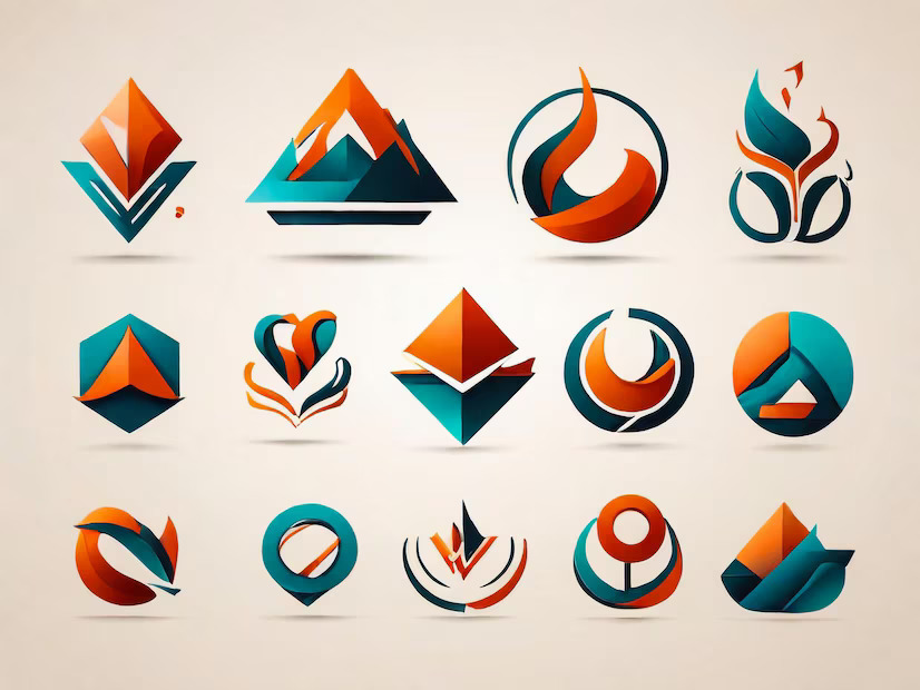
12. Don’t Be Generic
Do’s: Make your logo stand out, and use different and unique elements in your design to be different from your competitors.
There are so many coffee brands that use mugs or coffee beans in their logo; maybe you could use some other element for your coffee brand, like an espresso machine.
Don’t: Don’t use too obvious elements in your logo but also use only some aspects that aren’t related to your brand.
You can research and choose unique and distinctive elements for your logo instead of too obvious elements like a bed for a bed and breakfast. Understand different types of logos and what is good for you.
13. Avoid Trendy Logos

Do’s: It’s good to keep up with the trends. Trends have proved to be significant elements of promotion and marketing so it is better to be up to date.
It is a gate for new followers and customers, and thus, it is essential to be trendy. You can add a theme-based logo to make it more hyped and trendy.
Don’t Wait to change your logo too often because some trends are just not worth it. Seasonal changes are good and appropriate, but if you change with every trend, it will devalue the brand.
14. Logo In Motion
Do’s: Making your logo in motion provides a speed, effective, and modern touch to your logo. It looks fresh and constantly updated.
Don’t: Make all the elements in your logo look too zappy and busy. If you have more than one element in your logo, it’s better to avoid the motion effect.
15. Always Have A Second Option
Do’s: While creating a logo, it is recommended to have another option, a second option. Because your logo might be effective and eye-pleasing to you but not for your audience.
Don’t: Don’t use different logos on different platforms; just because you have another option, it doesn’t mean you will use it where and when it’s not needed.
Rules to Keep In Mind While Designing A Logo Design
Apart from these, there are specific logo design rules that you should keep at your fingertips.
1. Hiring A Professional
By hiring a professional, you can be stress-free because an expert logo designer already takes care of all the aspects discussed above.
An expert profoundly understands all the logo design do’s and don’ts.
2. Using Image Instead Of Text
Many still believe using images instead of text is compelling and unique but needs to be more professional and childish. Try to prevent using images in your logo to make it more professional.
3. Using Drop Shadow In Logos
People use drop shadows in their logo to give it a dramatic touch and rich effect, but it makes your logo foggy, unpleasant, and difficult to read.
Also, it looks hideous on printed t-shirts, posters, and billboards.
4. Your Logo Should Be Appropriate
When we advise people to use a distinctive or unique logo, they use entirely irrelevant logo designs for their brand.
You should always choose an appropriate logo related to your brand and convey your message instead of conveying nothing.
5. Your Logo Must Be Distinct, Memorable, And Simple
While designing a logo, make sure that it depicts your mindset and authenticates your brand, identity, and significance.
It should not be like other competitors’ sites. It should be inspiring, memorable, and simple so an audience can relate and be attracted to it.
Conclusion: Logo Design Guidelines
The key to the success of your branding is your logo. So, it’s essential to keep everything related to the logo in mind so there is no space left for mistakes.
The main point of making your logo design gold is to keep it simple, relevant, and versatile. Your logo should be easy to read and easy to connect. A good logo can skyrocket your brand value.
The key to an influential logo designer is an expert designer, so hire an expert now!
Explore Further:
Vince Logo Design is a distinguished digital marketing agency, specializing in crafting compelling brand identities and optimizing online presence. We are your partners in creating impactful digital strategies that drive results.
Get in touch.Articles
- Top 10 SEO Benefits of Responsive Web Design in 2025
- 8 Best CMS for Small Business in 2025: Pick the Popular
- 5 Best Hosting for Small Business Websites
- Affordable WordPress Website Design: Best Service Provider
- Custom Design Vs Template Website: Which One Is Best?
- Fix My WordPress Site: WSOD, Redirect & Site Maintenance
Get Free Consultancy
Fill the following form and receive a guaranteed response within 48 hours.


We have worked with world's leading brands