Pizza comes in a square box, baked as a circle, and sliced into triangles. But why so? Because the square is easy to carry, a circle is easy to cook, and a triangle is more accessible to eat. It proves the significance of shapes in our lives.
Logo shapes provide the meaning, emotions, and significance of a logo. It tells us about the services a brand offers and how trustworthy it is.
In this article, we will overview different shapes and their significance, the psychology behind them, shapes and their meanings, and how different logos with shapes express different things.
What Is A Shape?
A shape is a random arrangement of lines that come together and form a particular outline. A shape in geometry is an outline of an object, a boundary to a specific mold.
Shapes have significance apart from design; they are also used in the arts to voice emotions and to create creativity.
Shades are 2 dimensional, but with shading in dark and light colors, you can give it a 3-dimensional effect. You can create an effective logo by better understanding the meanings of shapes.
Designers give meaning to their brand by using logos with shapes. Let’s discuss the logo shapes and the meaning of shapes used in logos.
Geometric Shapes
We are surrounded by so many geometrical shapes. Different shapes evoke different emotions. Logo designs mostly have geometrical components to express various expressions.
You may be reading this on a square-shaped or rectangular-shaped device, or you may be sitting on a rectangular sofa or a square bed.
The 3 main geometrical shapes are circles, squares or rectangles, and triangles, and they are formed with vertical and horizontal lines.
1. Circle
The fact that our moon, sun, and earth are round makes us comfortable with circular objects. Circular shapes provide stability, femininity, unity, community, friendship, protection, and security.
Mostly, circles in the logo express community and unity, like the Olympic logo. Pinterest uses a circle in its logo to express femininity, and L.G. uses a circle to show reliability.
Circle provides a sense of completeness. The nonlinear and non-edging nature of the circle gives the feeling of continuity, that everything goes round and round, and that there is no end, which could also mean progress.
2. Square
Squares are the most common shape, and most people prefer squares because they are adjacent to our eyes and accessible to look at.
Square shapes show balance, stability, reliability, solidity, efficiency, strength, information, and professionalism.
BBC logo forecasts information, the LinkedIn logo shows professionalism, and the Domino logo shows a balance of flavors.
The square in the logo showcases your brand’s strength, it’s power, devotion, and professionalism. It is soothing to the eyes and is comfortable to look at.
3. Triangle
Triangles are the most effective, unique, and influential shapes used in logos. It shows power, energy, trust, strength, dependability, confidence, masculinity, science, and dynamics.
The triangle shape of Adidas shows uniqueness and confidence. The triangle in PRADA shows power and strength.
Most barbers use a triangle shape in their logo to convey that the customer can trust them and be dependent on them.
The triangle shape is multidirectional. If the peak is on top, it displays progress and modernity. If the triangle is 90° tilted, it shows motion (play), just like in the YouTube logo
4. Vertical and Horizontal Lines
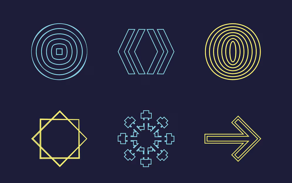
Vertical lines indicate courage, progress, dominance, strength, aggression, masculinity, and stability. The vertical lines in Soundcloud show progress, courage, and strength.
The horizontal line exhibits speed, community, calmness, tranquility, fluidity, and a sense of space. The horizontal lines in Spotify show speed, community, and connectivity.
Organic Shapes
The main 4 elements and the origin of organic shapes are earth, fire, water, and air. Organic shapes are used to produce feelings of belonging and home.
They don’t have any significant shapes and are just ordinary patterns or weird shapes. It could include flowers, stars, rocks, hands, feet, clouds, and leaves.
Organic-shaped logos are whimsical and fluid; they mostly flow and are not rigid at all. The best quality of organic shapes is that they are malleable and adaptable.
Most of the organic shapes used in the logo are hand-drawn to add rawness, dedication, and devotion.
You can use organic shapes in your logo to make it look soft, not edgy, and creative. The tiger in PUMA, the panda in WWF, and the apple in Apple are the most common examples of organic shapes.
Abstract Shapes
Abstract shapes denote emotion rather than concept. Instead of showing a concrete object, it will show quality and idea.
The most common abstract shape design you might have seen is the gender sign outside the bathroom. They classify the concept of the object rather than putting an exact object.
Abstract shapes are used to provoke emotions and connections in the audience. The Airbnb logo is the perfect example of an abstract logo because it combines people, place, and love to draw A of Airbnb.
Symbol And Cultural Shapes
Other than these, many different shapes are frequently used in logo designing, including stars, hearts, and crosses.
Star is used to show quality and service. For example, the logo of Paramount’s production shows the quality of the movies.
The heart is used to show love and romance. For example, the heart in the Pampars logo shows the mother’s eternal and unconditional love for her baby.
The cross is used either to show health or death. Many hospitals use crosses in their logo, but Death Squad uses crosses to show death.
A ribbon is used to show awareness and softness. The pink ribbon is used for breast cancer awareness, the red ribbon in Lays is used for taste and softness of flavor, and different colors represent different mental health disorders.
Diamond is used to show uniqueness. And are often used to show femininity and jewelry.
Shape Psychology In Logo Design
As we discussed earlier, different shapes produce different emotions in our bodies. Circular shapes produce feelings of harmony and protection. Square gives a sense of stability.
You can use shape psychology to your benefit and produce a logo that can resonate with your audience, make their connection with your brand, and attract them to your brand.
You can use shape psychology to make your logo more effective, but if you add color psychology + shape psychology, then nothing can beat your logo.
Conclusion
Make sure you hire an expert logo designer who has a deep understanding of all of these attributes and design a logo that conveys specific emotions and messages.
A good logo encourages your brand and grows trust. But remember to keep your logo relevant to your industry.
Explore Further:

Vince Logo Design is a distinguished digital marketing agency, specializing in crafting compelling brand identities and optimizing online presence. We are your partners in creating impactful digital strategies that drive results.
Get in touch.Articles
- Top 10 SEO Benefits of Responsive Web Design in 2025
- 8 Best CMS for Small Business in 2025: Pick the Popular
- 5 Best Hosting for Small Business Websites
- Affordable WordPress Website Design: Best Service Provider
- Custom Design Vs Template Website: Which One Is Best?
- Fix My WordPress Site: WSOD, Redirect & Site Maintenance
Get Free Consultancy
Fill the following form and receive a guaranteed response within 48 hours.
We have worked with world's leading brands


