What is the ultimate key to designing a good logo? Make sure to create a good logo. Simple! But what is a bad logo?
A bad logo is an uninformative, generic, descriptive, and complex logo that can’t be scaled. A bad logo is more of a threat to the brand rather than a blessing.
In this blog post, we’ll discuss examples of bad logo design and how they can potentially harm your brand and put your brand’s reputation at stake.
What Is A Bad Logo Design?
Bad logo designs are those designs that take away the authority and beauty away from your brand. Many huge companies have made the mistake of having poorly designed bad logos.
One of the common elements of bad logo design is that it can be envisioned differently; thus, it can have many meanings, and it ends up becoming a funny meme.
And as the saying goes, the best way to avoid mistakes is to keep learning from the mistakes. Let’s discuss the top 10 logos that end up being a bad logo design.
List of Things To Be Avoided
By following this list, you can successfully avoid a bad logo design.
- Having An Outdated Logo
An outdated logo takes away the relevancy of your brand. An obsolete logo shows that your company needs to be more active in updating, is stuck in the past, and needs a concept of modern technology.
If you want your company to have a retro theme, you can use popular elements from the 1980s or 1990s instead of never changing them.
- Having Too Many Details
Having too many details in your logo can make it look busy. A detailed logo looks amazing on big screens and banners, but it needs to be more clumsy on a small canvas or in merchandise.
Too-detailed logos are hard to scale and are way less versatile as compared to others. It’s better to have a relevant and concise logo that can be cost-effective, versatile, and easy to scale.
- Having Irrelevant Imagery
Logos with irrelevant imagery are such a late trend because no matter how conveying your image might be, it can only be used in the text.
You can add a small and relevant image to your logo but don’t overuse them, and never use them in place of text.
Many brands also use completely out-of-context images in their brand logo, which has nothing to do with the brand and its elements.
- Having A Logo That Lacks The Concept of Kerning
Kerning means a concept of spacing between letters. All the logos with bad spacing between them look pathetic and unclear, which leads to many misinterpretations.
While designing a logo, a designer should be mindful of the fonts, their spacing, colors, and their significance; otherwise, your logo will become hard to read and unpleasant to look at.
Try to experiment with the frosting, but use only a few non-essential fonts. A combination of two or three fonts is more than enough.
- Having A Complicated Design
A complicated design is just forcing all the elements of designing into the logo, even if it looks unpleasing and overbearing. Instead of crowding your logo design, it’s better to keep it minimal.
Logos with conflicted and complicated themes need to be more professional. Also, the theme is a trendy fashion, and it changes over time, so one more disadvantage of complicated design is that it makes your logo time-bound.
- Having A Common And Generic Logo
A common logo takes away the uniqueness of the logo. To make your company stand out, your logo should be distinguished, memorable, and impressive.
But remember to maintain the authority and relevance of the brand just to make it unique. Your logo should link back to your industry, your brand, and your products and services.
- Having No Concept Of Contrast
Having too many colors in the logo doesn’t look appealing to people. It’s better to understand the color psychology of logos when designing a resonating logo.
While designing a logo, people either use no color at all or too many colors at the same time; both of them are wrong. Your logo should have a particular color scheme with 2 or limited colors. It’s always a better idea to test your logo by rescaling it.
Having a bright logo can be sore to the eyes, and having too muted a color logo can bore the audience; try to have a combination of the two.
- Having A Too Vague Logo
The logo is your brand’s representation. It should attract the target audience and convey the message of your brand. If your logo doesn’t tell people about your brand, it’s useless then.
People tend to use vague logos to avoid detailed logos, which is understandable until and unless the logo needs to be remembered to voice the brand’s identity.
- Having A Plain, Ugly Logo
A logo should be enthralling, attention-grabbing, and encouraging. A plain and ugly logo is nothing but just the brand’s name that is silent and has nothing to offer.
Having a plain and no-effort logo can deflect your audience and push them away instead of welcoming them.
- Having Random Elements, Icons and Logo
While designing a logo, keep your audience in mind; if your logo is not directional, then it will lead your brand astray.
Having random elements orbiting the main text that add no significance to your brand can make your logo look childish, and having a lot of icons can drift attention away from the main text/icon.
Examples Of Bad Logo Design
Now that we know what converts a logo into a bad logo design, let’s review some of the historically bad logo brands so you can learn from their mistakes.
- Kids Exchange

This is a classical scale of bad fronting and not taking spacing seriously. The bad spacing changed the whole meaning of the logo.
- Gap

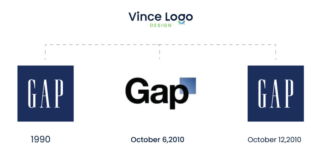
The reason why this logo failed was that the change could be random, and Gap should have remembered to keep the audience in mind and eventually changed it back to the original.
- Bing

The reason behind the failure of this logo was that the logo needed to be more attractive to attract an audience and had a font that needed to be updated.
- Apple

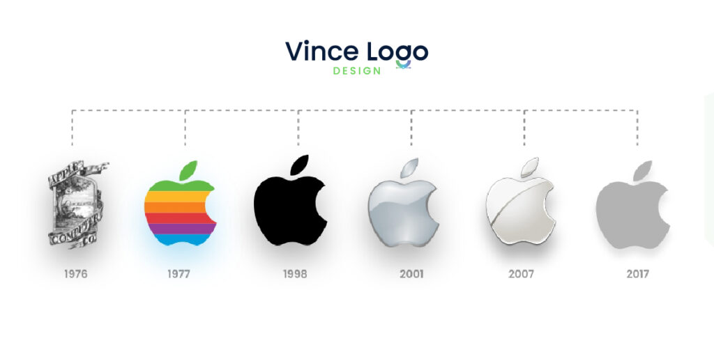
The previous logo of Apple needed to be updated and scalable, so over time, the company remodeled the logo to make it better suited to the current marketplace.
You can see from their logo how much your marketplace is affected by a good vs bad logo design and how important it is to keep your log updated to make your brand perform well.
3 Helpful Tips To Avoid Bad Logo Design
Drawing a logo design or deciding on a logo design is a tough job, but these 3 tips will be handy while making such a daunting task.
- Hire an expert logo designer to design you a relevant and up-to-date logo design.
- Learn to design logos to understand the basic elements of logo designing.
- Have a memorable and quirky pictorial mark.
Conclusion: Poorly Designed Bad Logos Can Impact Marketing
Poorly designed logos can have a hazardous impact on marketing. By taking care of all the discussed elements, you can prevent a bad logo design and create an effective business logo.
A classic example of this is the 2012 London Olympic logo because a bad logo needs to be more representative of the brand and also keep the attention to the logo only. The main focus of the brand got lost in between.
Many bad logos end up being part of funny banter and overshadow the brand’s identity. Instead of benefiting from the logo, the brand ends up paying for it, and it eventually comes to an end.

Vince Logo Design is a distinguished digital marketing agency, specializing in crafting compelling brand identities and optimizing online presence. We are your partners in creating impactful digital strategies that drive results.
Get in touch.Articles
- Top 10 SEO Benefits of Responsive Web Design in 2025
- 8 Best CMS for Small Business in 2025: Pick the Popular
- 5 Best Hosting for Small Business Websites
- Affordable WordPress Website Design: Best Service Provider
- Custom Design Vs Template Website: Which One Is Best?
- Fix My WordPress Site: WSOD, Redirect & Site Maintenance
Get Free Consultancy
Fill the following form and receive a guaranteed response within 48 hours.
We have worked with world's leading brands


