Have you noticed a subtle yet significant shift in the world of branding lately? From tech giants to emerging startups, lowercase logos are everywhere. But what’s behind this lowercase logo trend, and why is it gaining traction?
Lowercase logos are shaking up the traditional branding landscape, offering a fresh perspective on visual identity.
In this comprehensive exploration, we’ll uncover the psychology behind lowercase logos, examine notable examples of brands embracing this trend, and dissect the reasons and
benefits of opting for lowercase typography in branding.
So, join us on a journey to decode the lowercase logo trend and discover its power to transform brand identities in the digital age.
What is a Lowercase Logo Design?
A lowercase logo design uses all lowercase letters in a brand’s visual identity. It represents a departure from the traditional use of uppercase letters, often associated with formality and authority.
Lowercase logos convey a more casual, approachable image, appealing to contemporary sensibilities and reflecting modern brand values.
By utilizing lowercase typography, brands can evoke a sense of intimacy and friendliness, fostering deeper connections with their audience.
Moreover, Lowercase logos also offer greater versatility and creativity in design, allowing for more fluid and dynamic compositions.
In essence, lowercase logo design represents a shift towards simplicity, inclusivity, and innovation in branding and visual communication.
Examples of Brands That Have Lowercase Logo Design
Lowercase logos have become increasingly prevalent across various industries, reflecting a modern approach to branding and design.
Here are some notable examples of brands that have embraced the lowercase logo trend:
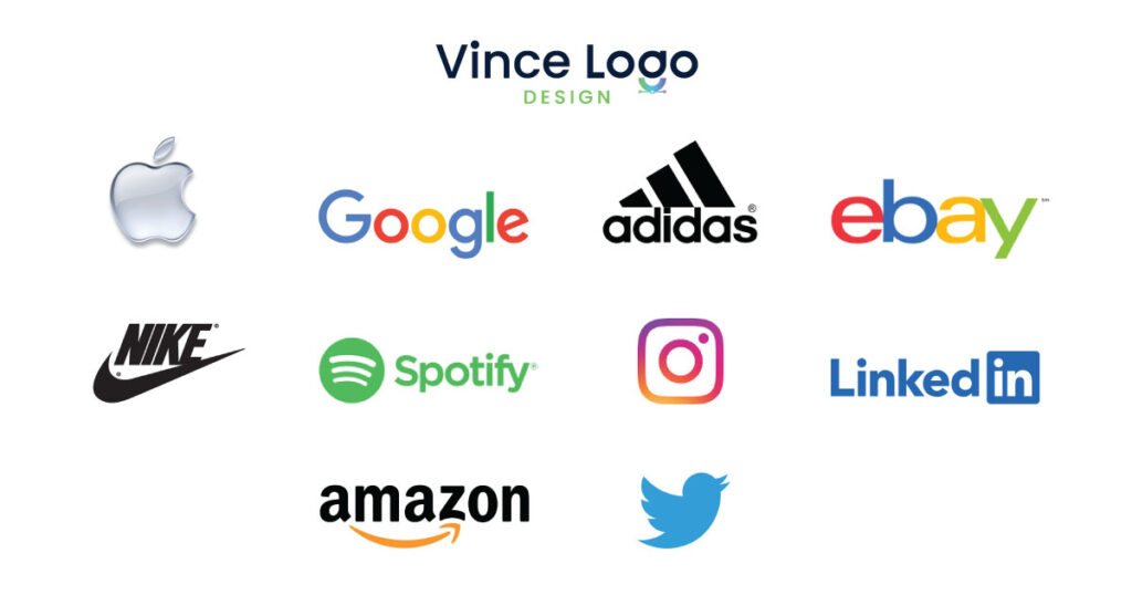
- Apple: One of the pioneers of minimalist design, Apple’s lowercase logo—a sleek, bitten apple—has become iconic in tech. It epitomizes the brand’s commitment to simplicity and innovation.
- Google: The search engine giant’s lowercase logo is instantly recognizable. It features vibrant colors and playful typography and reflects Google’s ethos of accessibility and creativity.
- Adidas: The renowned sportswear brand opted for an all-lowercase logo, emphasizing its commitment to inclusivity and contemporary style. The lowercase “a” in Adidas adds a subtle touch of sophistication to the famous brand’s visual identity.
- eBay’s lowercase logo, adorned in vibrant colors, exudes vibrancy and dynamism. The lowercase letters convey a friendly, approachable vibe, reflecting the brand’s focus on community and connectivity.
- Nike: Nike’s lowercase logo, often accompanied by the iconic swoosh symbol, exudes energy and athleticism. The simplicity of the lowercase typography allows the brand’s message of empowerment and perseverance to shine through.
- Spotify: The streaming platform’s lowercase logo is instantly recognizable, symbolizing its commitment to accessibility and user-friendliness. The lowercase letters in “Spotify” convey a sense of intimacy, inviting users to explore and discover new music.
- Instagram: With its lowercase logo featuring a stylized camera icon, Instagram has become synonymous with visual storytelling and social connectivity. The platform’s casual, user-centric content-sharing approach is reflected in the lowercase typography.
- LinkedIn: LinkedIn’s lowercase logo and the distinctive “in” symbol represent professionalism and networking in the digital age. The lowercase letters transfer a sense of approachability, making the platform more accessible to users worldwide.
- Twitter: Twitter’s lowercase logo, adorned with the iconic bird symbol, embodies the platform’s ethos of brevity and immediacy. The lowercase typography reflects Twitter’s user-friendly interface and real-time communication style.
- Amazon: Amazon’s lowercase logo, featuring a curved arrow from “a” to “z,” symbolizes the brand’s commitment to providing everything from A to Z. The lowercase letters convey a sense of inclusivity and accessibility, reflecting Amazon’s diverse range of products and services.
Reasons Why Brand Logotypes Used Lowercase?
Brand logotypes are often in lowercase for several reasons:
1. Accessibility: Lowercase letters are generally easier to read, especially in digital formats, enhancing the accessibility of the brand’s identity across various platforms and devices.
2. Approachability: Lowercase typography conveys a more casual and friendly tone, making the brand appear approachable and relatable to its audience.
3. Contemporary Aesthetic: Lowercase logos are perceived as more modern and stylish in today’s logo design landscape, aligning with current design trends and consumer preferences.
4. Versatility: Lowercase letters offer greater flexibility in design, allowing for more creative and fluid compositions that can adapt to different branding contexts and applications.
5. Differentiation: Using lowercase typography can help a brand stand out from competitors who may rely on traditional uppercase logotypes, giving it a distinct visual identity in the marketplace.
Top Brands Logos That Have Changed from Uppercase to Lowercase
Several brands have strategically decided to transition from uppercase to lowercase logos, reflecting shifts in branding philosophy and design trends.
Here are some notable examples:
1. Mastercard: In 2016, Mastercard disclosed a new lowercase logo, replacing its previous uppercase iteration. The move was aimed at modernizing the brand and enhancing its digital presence.
The lowercase typography and iconic overlapping circles embody Mastercard’s commitment to simplicity and innovation.
2. eBay: eBay underwent a rebranding in 2012, which included a switch from an all-uppercase logo to a lowercase version.
The vibrant colors and playful design of lowercase letters reflect eBay’s evolution from an online auction platform to a dynamic e-commerce marketplace.
3. American Airlines: In 2013, American Airlines introduced a new logo featuring a lowercase “a” in “American.” The change departed from the airline’s long-standing uppercase branding and symbolized a fresh start following its merger with US Airways.
The lowercase typography conveys a sense of approachability and modernity while retaining the brand’s heritage and legacy.
4. Instagram: While Instagram’s original logo featured uppercase letters, the platform underwent a redesign in 2016, introducing a lowercase logo accompanied by a stylized camera icon.
The lowercase typography reflects Instagram’s user-friendly interface and casual, social-centric ethos, catering to its diverse user base.
5. Pinterest: Pinterest updated its logo in 2011, opting for a lowercase “p” instead of the previous uppercase version.
The lowercase typography, adorned with a distinctive red “pin,” embodies the platform’s mission to inspire creativity and discovery in a visually appealing manner.
6. Microsoft: Microsoft unveiled a new logo in 2012, transitioning from uppercase to lowercase letters. The lowercase typography and the iconic four-colored window symbol reflect the company’s evolution towards a more modern and inclusive brand identity, emphasizing accessibility and innovation.
These examples illustrate how brands have leveraged lowercase logos to signal a shift towards modernity, accessibility, and innovation while maintaining their core identity and values.
The transition from uppercase to lowercase typography often represents a strategic decision to stay relevant in an ever-evolving marketplace and resonate with contemporary consumers.
The Future of Lowercase Logos
As the trend continues to spread, it’s clear that lowercase logos are here to stay.
Businesses that embrace this approach often benefit from enhanced brand recognition, increased relatability, and the ability to stand out in a crowded marketplace.
Whether you’re a startup or an established brand, the lowercase logo trend presents a compelling opportunity to redefine your visual identity and connect with your audience more meaningfully.
Conclusion: Join the Lowercase Movement
In conclusion, the lowercase logo trend represents more than a stylistic choice—it reflects shifting consumer preferences and evolving design sensibilities.
By harnessing the power of all lowercase letters, brands are forging deeper connections with their target audience and outshining a crowded marketplace.
Ready to Embrace the Lowercase Logo Trend?
If you’re ready to explore the power of lowercase logos and elevate your brand’s visual identity, contact us today to learn more about our design services.
Our design experts will work with you to create a logo connecting your brand and target audience.
Keep Exploring:
Vince Logo Design is a distinguished digital marketing agency, specializing in crafting compelling brand identities and optimizing online presence. We are your partners in creating impactful digital strategies that drive results.
Get in touch.Articles
- Top 10 SEO Benefits of Responsive Web Design in 2025
- 8 Best CMS for Small Business in 2025: Pick the Popular
- 5 Best Hosting for Small Business Websites
- Affordable WordPress Website Design: Best Service Provider
- Custom Design Vs Template Website: Which One Is Best?
- Fix My WordPress Site: WSOD, Redirect & Site Maintenance
Get Free Consultancy
Fill the following form and receive a guaranteed response within 48 hours.


We have worked with world's leading brands