A logo is a symbol that not only showcases the brand identity but also helps people identify the brand in the crowd.
According to the opinion of expert designers, logo isn’t just about text, however, even a simple mark can be powerful, like Nike’s swoosh.
Often, people ask, What is the difference between a logotype and a logomark?
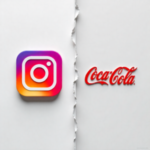
In simple words, a logomark is a symbol that visually demonstrates a brand, like Instagram, Facebook, Twitter, and Starbucks.
On the other hand, the logotype does the same job but in a text-based written practice. The font style is a key approach that makes the design memorable among people, something like Coca-Cola, LEGO, BBC, and many more.
As they combine together, a unique logo comes into existence, which is the result of blending visual symbols and characters, effectively defining brand identity.
But how?
Every brand has its own story, style, and goals. So, how do we pick the perfect logomark vs logotype? And where the mixture of both logos will be good.
In today’s article, we will consider these questions by doing an in-depth discussion on logomark vs logotype.
Additionally, to make it more relatable, we explore some real-time examples.
Logomark Vs Logotype: Spotting the Difference
| Aspect | Logomark | Logotype |
| Focus | Imagery | Text |
| Best for | Brands who want global recognition or have hard-to-translate names. | Brands with long names or operating the business in niche markets. |
| Brand Strategy Impact | Symbolic representation means solid appearance identity. | Highlight the actual name, helpful for being memorable for targeted ones. |
| Usage Consideration | Ideal in case, when requirement is visual identity instead of name clarity | Consider when name recognition is an important strategy. |
| Role in Branding | Best Approach for brand visual identity. | Same, best for brand visual identity. |
| Combined Use | Collaboration work well, like nike and it’s check sign, until the text of logo is not extensive in size. | Paired with a logomark can be a great work for visuals, especially, when the logo mark is designed as an alphabet. |
Where to Use Logotypes and Logomarks?
1. Business Cards:
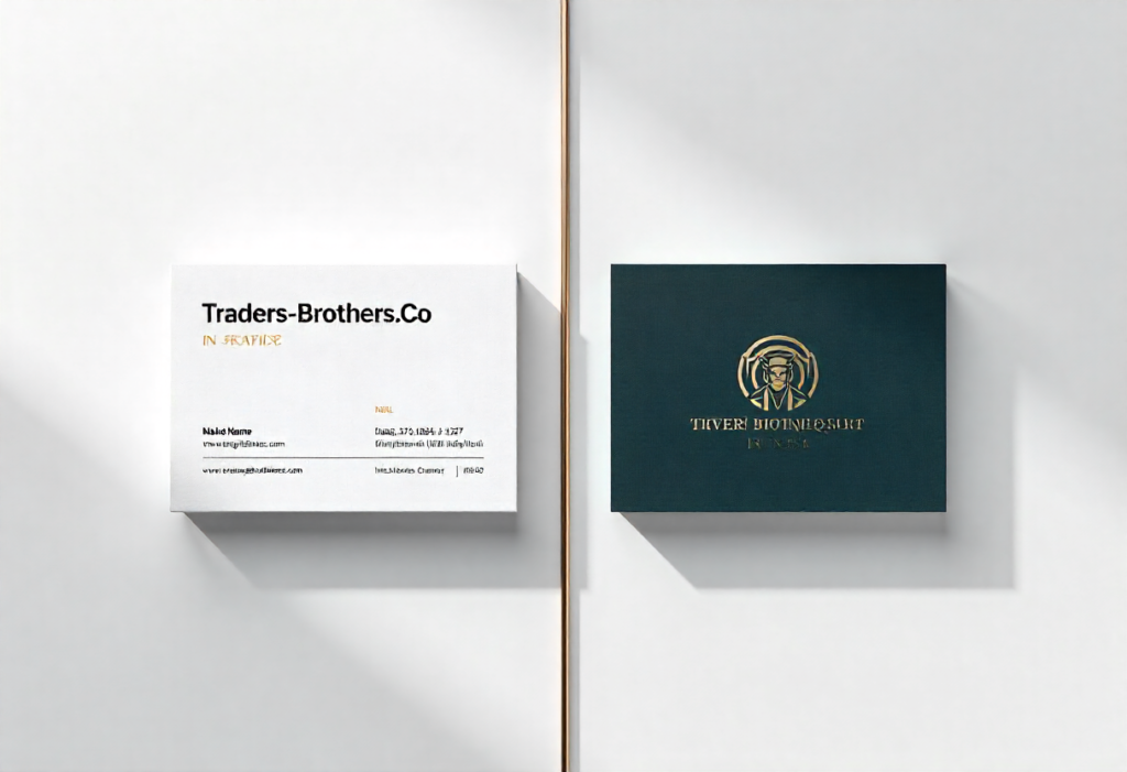
Logotype: Utilizing the logotype will be a great approach when you’re aiming to display your brand name in a clear and readable manner.
Logomark: Looks efficient and professional, when a single logo appears on the card as a recognizable and meaningful symbol that helps the brand to address what it does.
2. Websites:
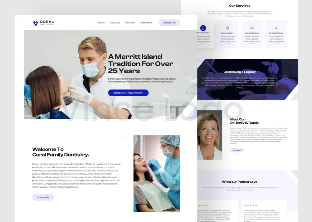
Logotype: On websites, the logotype works by helping the viewer to understand what the site is offering, plus it is a good strategy from the SEO perspective.
Logomark: Logomark works the same as the logotype, but it is based on a more enhanced and creative practice. Unfortunately, not as impactful as the written approach.
However, their combination will work incredibly well as you design them in a pair.
3. Social Media:
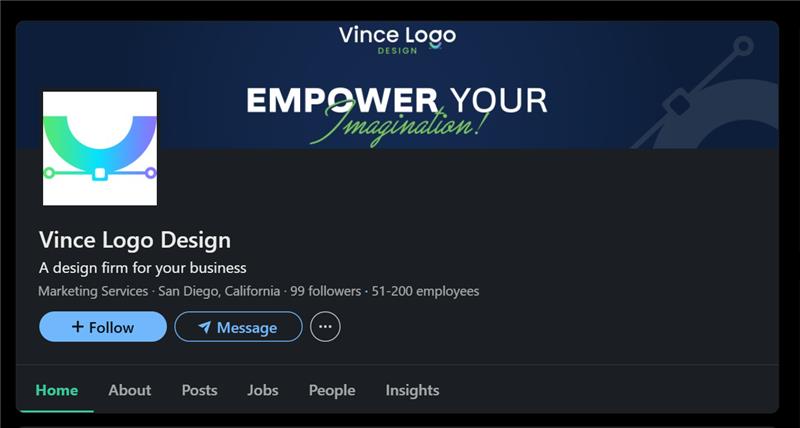
Logotype: In media apps, the logotype works consistently by offering brand presence clearly across all platforms by displaying the label.
Logomark: Acts as a recognizable avatar, which displays from profile picture to dedicated post; this increases memorability.
4. Merchandise:
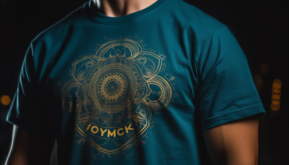
Logotype: From wearing shirts to plastic bottles or every appropriate-sized holder product, enable the brands to increase visibility as they use the logotype.
Logomark: A single appealing monogram logo should be enough to allow the product to be captivated and memorable for users or viewers, plus if the design is trendy, it could flip the dice.
5. Signage:

Logotype: On signboards, your brand name looks visible and recognizable, even when people are far away from it.
Logomark: It serves as a strong demonstration of your brand symbol with high visuals. Like:
People acknowledge by seeing the signboard of a burger even from a distance that there is a burger shop nearby.
What Is a Logomark? Deep Explain with Pros & Cons
A logomark is a symbol, that is utilized to display a brand identity.
Often these logos hold two things: the Service they offer and an alluring Edge or an Alphabet.
No doubt, the logo’s final version came as they passed the refinement and structure alignment phases.
As designers, we build a logomark with the motive of a simple, memorable, and future-proof product.
Additionally, we design it in a way to make it versatile and practical for use across different mediums/platforms, from business cards to billboards or even for social media profiles.
Logomark Examples:
Here are some famous examples of logomarks that are simple in design but have an identity and the ability to rule the market:
- Nike’s swoosh: The logo is not only recognized in the innovative and aesthetic fashion industry, but it also holds a global impact on athletic society.
- Apple’s Bitten Apple: Iconic logo which represents a brand that breaks the record annually of tech sales, especially smartphones.
- Twitter’s bird: Logo defines, digital voice has no barriers. A global communication and networking social app.
Advantages and Disadvantages Of Logomark
Advantages:
- Unique Visual Communication: By the combination of elements, characters, and symbols, a logomark is prepared, which is the result of multiple edits and refinements. The motive behind it is to make a logo that defines the brand value
- Flexibility: The logomark design in a way that looks suitable in all sizes, while implementing or uploading it on multiple platforms.
- Memorability: The more you work on the design by combining the elements, symbols, and colors for a design, the better version you will get that will be memorable and recognizable even from a distance.
Disadvantage:
- Design Expertise: You should have experience in the design field, because the whole work is based on the creativity of the designer. If the logo you are making is for a professional deal, instead of taking a risk, ensure to utilize the help from a professional, like Vince logo design team, dedicated experts with an authorized portfolio holder.
- Potential Similarity: Beginners take inspiration to build the logo, which is not a bad practice. But making it the same as the other brand makes the logo a duplicate, which confuses the users and decreases the uniqueness of your design.
- Slower Brand Recognition: For emerging brands, utilization of a logomark could result in slow identification and growth as compared with the logotype.
What Is a Logotype? Deep Explaining with Pros and Cons
Logotype also has similar work to a logomark to visually look impactful and showcase the brand identity.
The difference simply is that this logo is a wordmark that is designed in the sense of being united and cohesive, which will define the logotype as a combination of aesthetically appealing characters.
A logotype could be simple and complex as well, it’s depending on the design type that we select to make a charming logo for ourselves or clients.
Logotype Examples:
To go in-depth into this topic, we are utilizing the example approach, which will be recognized as synonymous with their respective brands:
- Coca-Cola: The iconic brand of the 19th century, which people have been consuming since their childhood. The brand’s script logo defines the identity of the product that the brand owns.
- Google: A platform that doesn’t require any introduction, its simple custom-design sans-serif font already defines the company identity worldwide.
- Microsoft: One of the most recognizable names since the late 19s. A tech company name that is made by a bold and modern font that is addressable globally.
Advantages and Disadvantages of Logotype
Advantages:
- Attractive: These logos are incredible attention grabbers in both aspects. If you are a designer, you are attracted by the simple and charming formation of colors and the implementation of different styles. But if you are a viewer, this makes you aware of the brand identity and its values, which is a best-selling part that makes a logotype memorable.
- Readability: The typography is helpful to make the logo readable, as it enhances readability in different media like newspapers, social media, and digital media, which is the best part when comparing the logomark vs logotype.
- Simplicity: The Characters you will design lie between creativity and simplicity. Which makes the element’s texture charming.
Disadvantages:
Creativity: In comparison with the logotype, the creativity requirement is less. You can create, by utilizing the text, colors, logo, and fonts; the idea implementation would be limited.
Scalability: As per our team’s experience, the logotypes are based solely on text, and sometimes it becomes difficult to scale down without blurring.
Placement: Text-based logomarks, especially the long wordy logos, can’t fit in every platform or medium, just like stamps or social profile pictures. So, a special enhancement is needed for this.
Special Tip:
If an individual is unable to implement creativity in their designed logo, especially if the logo is for professional or brand demonstration use, it is preferable to approach an expert who can renew and recreate your logo, such as the Vince Logo Design team.
We are the professionals, who have been practicing this skill for the last 10 years. In this journey, we understood, even in a casual conversation, what a person is looking for and what they genuinely need.
If you want to find out which type of logo your brand needs to demonstrate its identity, contact us without paying a single penny. Maybe an unprofessional or irrelevant logo is the reason for growth loss.
Conclusion:
In today’s article, we explored the key differences between logomarks and logotypes, plus we covered how they’re alike, what sets them apart, and how they can evolve.
As an expert in logo designing services, we claim that both the logomark and logotype are important in their specific situation for making your brand easy to recognize and memorable in the sight of viewers.
“Whether it’s logotype or logomark, your brand can speak loudly through both of them, just perfection is the condition”.

Vince Logo Design is a distinguished digital marketing agency, specializing in crafting compelling brand identities and optimizing online presence. We are your partners in creating impactful digital strategies that drive results.
Get in touch.Articles
- Top 10 SEO Benefits of Responsive Web Design in 2025
- 8 Best CMS for Small Business in 2025: Pick the Popular
- 5 Best Hosting for Small Business Websites
- Affordable WordPress Website Design: Best Service Provider
- Custom Design Vs Template Website: Which One Is Best?
- Fix My WordPress Site: WSOD, Redirect & Site Maintenance
Get Free Consultancy
Fill the following form and receive a guaranteed response within 48 hours.
We have worked with world's leading brands


