Are you looking at which color best fits your brand? Well! Here’s your answer.
To choose the right color, you need to learn about the psychology of color and its meaning to create an outstanding logo that will boost your brand and develop lasting effects in the long run.
Colors have the powerful ability to promote emotions, convey messages, and shape perceptions. Understanding color theory and psychology is essential in the logo design process, which builds a connection with the audience and influentially communicates your brand’s message.
In this blog post, we’ll unveil the meaning of logo color and explore the color psychology in logo design. Afterwards, you can select the perfect logo color that impresses the consumers.
Let’s dive into the world of color psychology!
What Is Color Psychology?
Colour Psychology is the study of colors that tells how color impacts human behavior and emotions. Different colors, hues, and tones have other associations that affect the human mind and behavior and thus change the mood. Also, Color psychology depends on culture and is associated with different festivals.
Moreover, color significantly impacts marketing, where buyers attract brands and products due to their physical appearance. As a result, it will increase your potential growth, and your customers will find your products appealing.
Therefore, choosing the right color for your brand’s goals and attracting your target audience is essential.
Why is Color Psychology Important in Logo Design?
In the linguistics and cultural review, Oscario stated that a logo is the most crucial visual identity element. Logos have also been applied to other graphical identity applications. Hence, it is essential to create a logo that can reflect the personality and soul of your brand.
A logo is a graphic element in the form of an ideogram, an emblem icon, or a symbol of your brand. It is your brand’s primary physical attribute.
So, the right choice of color will enhance your brand’s impact on customers and represent its soul. It will connect you with your customers.
Color psychology influences your brand globally. This is why big brands use color psychology while affecting clients and are emotionally attached to them.
Reveal your business logo design and look at the clients and how they quickly seek out your brand’s services due to the selection of your colors. There is no guarantee of success with the keen attention on color psychology; there are other elements of logo designs to look at as well.
However, research says it can help your business grow and is worth considering.
Color Psychology in Branding and Marketing: Key Takeaways

Colour significantly impacts human emotions, moods, choices, and behaviors. We’ve researched deeper and developed a study on the psychology of color in marketing and branding. Let’s have a look below.
- Colors influence brand awareness by up to 80%.
- Colors increase the shopping rate by up to 85%, and the clients will make a purchase.
- Around 62-90% of the product assessments rely on colors.
High Impact of Color in Logo Design
Color helps your logo to stand out in the marketplace. It is a visual representation of what you want to represent to your consumers. It is a feeling that you want to connect emotionally to your clients and attract them to your brand. You should understand color psychology to succeed in your brand or business goals.
On the contrary, choosing the unfortunate color will negatively affect your clients, conveying the wrong message. Thus, you will lose your potential customers and decline your progress.
Don’t fret at all! We’re here to help you choose the best color and explain each color’s meaning in detail. Let’s move on to our next section.
How to Choose the Best Color for Logo Design?

What color is perfect for your brand? Well, it depends. No guideline shows that a particular color is suitable for your brand.
First, you must understand the brand’s core values and personality, then match them with the color. Also, consider the meaning of logo color to quickly create a color palette for your brand.
Let’s examine each color for better understanding.
Red Color Logo
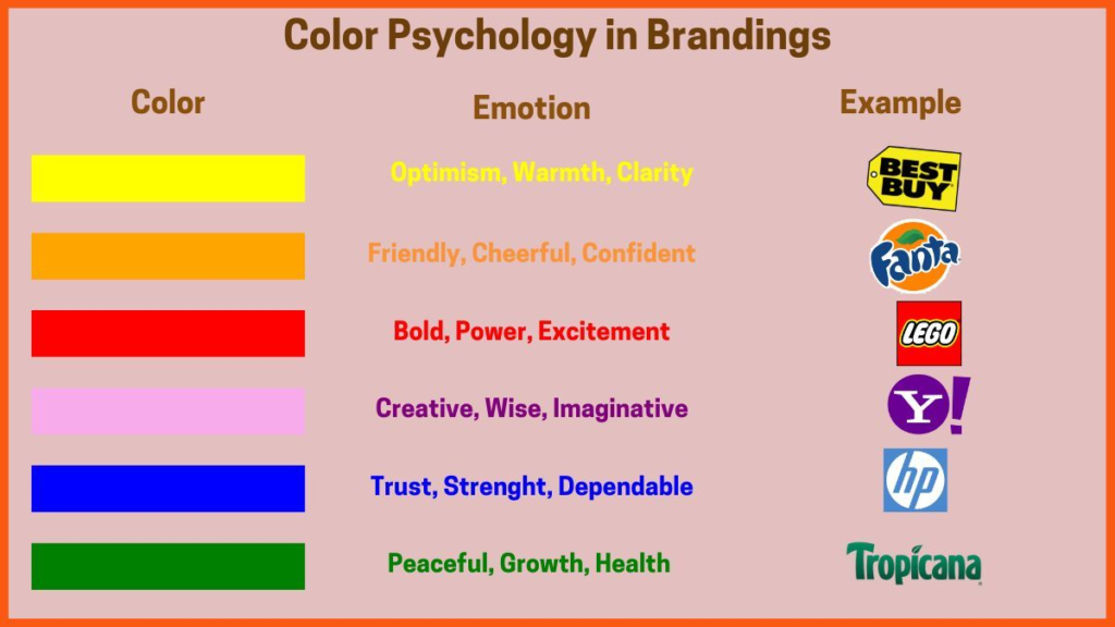
Red symbolizes love, passion, and danger and is used to create a memorable design that impacts branding and marketing. If you want to transfer a feeling of love, passion, and excitement, you can use red in your logo design.
Red is a go-to choice for businesses that are loud, playful, youthful, and modern. If your business attributes these elements, then go with the red color!
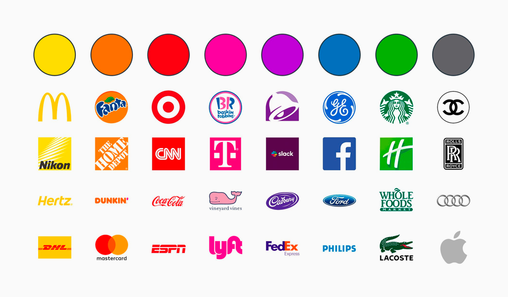
Some top brand examples that use red color are Netflix, Coca-Cola, YouTube, and Pizza Hut.
Orange Color Logo
Orange represents the feeling of being cheerful, friendly, and enthusiastic. It influences the essence of creativity, optimism, adventure, and friendship. If you want to share the feeling of freshness, excitement, innovation, and willingness, orange is the perfect choice.
But be careful with the tone of orange. The brighter orange color in the logo will be a little harsh to consumers’ eyes and can negatively impact the customer. We recommend you choose a preacher tone for your brand logo design so it can be eye-catching and attractive. It is best for energetic, entertainment, food, and beverage brands.
Some trendy examples are Dunkin Donuts, Nickelodeon, Alibaba, Fanta, Firefox, Amazon, and The Home Depot.
Yellow Color Logo
Yellow symbolizes summer and sunshine, which depicts the power of creativity, happiness, and optimism. If you want to convey an image of friendliness and approachability, use the color yellow in your brand logo design. Yellow logos are good for food, sports, and travel brands.
Some famous examples that used the yellow logo are Nikon, McDonald’s, National Geographic, and Snapchat.
Green Color Logo
Green represents nature, growth, renewal, and new life, transferring a feeling of harmony, rest, and balance. It is a natural and environmental color that shows regrowth, reminding us of the power of nature and the renewal journey of life. Green logos are best suited for food, environment, and vegan brands.
Some examples are Heineken, Tropicana, Whole Foods Market, Heineken and Starbucks.
Blue Color Logo
Blue represents the feeling of calm, control, honesty, trust, and confidence that helps build a connection between you and your consumers. It is also used in peaceful places, including bedrooms, hospitals, and spas.
However, if you opt for blue, you have many competitors, so you must use a blue color that stands out in the crowd. We’ve suggested not using blue, as we researched that many brands already use blue. But if it is associated with your brand’s message, go for it immediately!
Some examples are Ford, Samsung, Nivea, and Paypal.
Purple Logo Color
Purple and violet represent an image of luxury and royalty. Therefore, if your products are luxurious, use purple or violet for your business logo. Purple represents spirituality and depicts the essence of creativity, sophistication, extravagance, mystery, and fantasy.
Also, purple logos are more powerful and eye-catching and attract consumers, especially when blended with gold. Purple color is also excellent with packaging. For example, Cadbury chocolate, when you look at the brand, you will associate it with delight. Therefore, purple is best for technology, food, and luxury brands.
Cadbury, yahoo, and Twitch are famous brands that use purple logos.
Pink Color Logo
Pink symbolizes hope, fantasy, calmness, inspiration, and softness. It represents feminism and kindheartedness, so it is mainly used in beauty brands, fashion products, toys, and baby products due to its symbolism of innocence. Due to its feminine and playful essence, it is not suitable for corporate and industrial brands.
Some examples of the pink logo are Dribble, Dunkin’ Donuts, Adobe Indesign, Barbie, and Baskin-Robbins.
Brown Color Logo
Brown color represents masculine, rugged, and severe traits not commonly used in logo designs. However, you can opt for this color if it matches your brand personality, and even with having a low competitor rate, it will help your logo stand out quickly in the marketplace.
Additionally, the brown color has an essence of strength, maturity, safety, and down-to-earth traits. It is best for Agricultural, ecological, food, and transport brands.
Some of the best examples used in brown color logos are Nespresso, UPS, Gloria Jeans Coffee, A&W Root Beer, and M&M’s.
Black Color Logo
Black symbolizes darkness and dullness, but it is trendy and a well-known color for luxury brands. It represents power, efficiency, elegance, and prestige. Regardless of color, your brand logo must be available in black for different designs.
Moreover, black logos show a severe and strong personality, which is best for IT, fashion, and equipment brands.
Adidas, Nike, Gucci, and Uber are the top brands that use black logos.
White Color Logo
White represents enlightenment, purity, sincerity, and simplicity. It is used as a complementary color in logo design and creates negative space instead of playing the role of the primary color.
Some examples of famous brands are FedEx, Tesla, and The North Face.
Gray Color Logo
Gray is a blend of white and black. It is the perfect color if your brand personality represents maturity, classic, and serious attributes. Grey in logo design displays an image of professionalism, dignity, classic, modesty, and stability.
However, gray, due to its lack of bright color, depicts dullness and a dull image. Therefore, we suggest choosing the colors according to your brand personality and core values.
Some brand examples that use gray in logo design are Apple, Audi, Mercedes Benz, Skechers, and Husky.
The Most Popular Logo Colors in Branding
Each color has a unique essence and conveys different messages. The most used colors in branding are red, blue, yellow, and green. As we already know, red represents power and passion and depicts an image of strength and vibrancy of the brand. Blue is a calm and serene color representing the business’s trustworthiness and dependability.
Yellow and green are also well-known colors; yellow represents happiness and optimism. While green displays growth, nature, and love. We’ve covered the top trending colors used in branding, but you can opt for any color that conveys your brand message globally and widely.
Precautions Before Selecting Any Color
We’ve researched and gathered some precautions to consider when selecting your logo design color. Here are the key points:
- Refrain from mixing colors in a way that can make it hard to read your brand message and cause discomfort to your eyes. Instead, go simple and create a decent design that appeals to your target audience.
- Be aware of cultural nuances while selecting a color for your logo. Different colors have different meanings and symbols. For example, white symbolizes purity, while black shows dullness.
- Make your color theme simple yet straightforward to clearly convey your message to your target audience. Excessive use of vibrant colors will make your logo a hazard and ruin the visual effects.
Conclusion
To wrap up, a logo is your brand’s face and identity. Hence, choosing the right color will make a lasting impression on consumers, while the wrong color will ruin your brand’s personality.
Thus, the psychology of colors plays a vital role in logo design and creating an image in the marketplace. Therefore, consider a professional logo maker who picks the right color that resonates with your audience and creates a mesmerizing look for the audience.

Vince Logo Design is a distinguished digital marketing agency, specializing in crafting compelling brand identities and optimizing online presence. We are your partners in creating impactful digital strategies that drive results.
Get in touch.Articles
- Top 10 SEO Benefits of Responsive Web Design in 2025
- 8 Best CMS for Small Business in 2025: Pick the Popular
- 5 Best Hosting for Small Business Websites
- Affordable WordPress Website Design: Best Service Provider
- Custom Design Vs Template Website: Which One Is Best?
- Fix My WordPress Site: WSOD, Redirect & Site Maintenance
Get Free Consultancy
Fill the following form and receive a guaranteed response within 48 hours.
We have worked with world's leading brands


