
Amazon is recognized as a large-scale e-commerce business, but its services are not limited to buying and selling. However, it has expanded into a Marketplace, cloud computing (AWS), device and media services, an entertainment platform, and much more.
Despite its massive growth, it still holds the same vision that they started with, enabling seekers to find what they are searching for.
The platform is designed as visionary, with an impressive layout and incredible services. Every single step integrated in Amazon has a motive behind it. Even its logo has a hidden meaning, which showcases Amazon as a promising platform.
What is the Amazon logo Meaning?
Commitment and Customer satisfaction are the meaning of Amazon’s modern design logo.
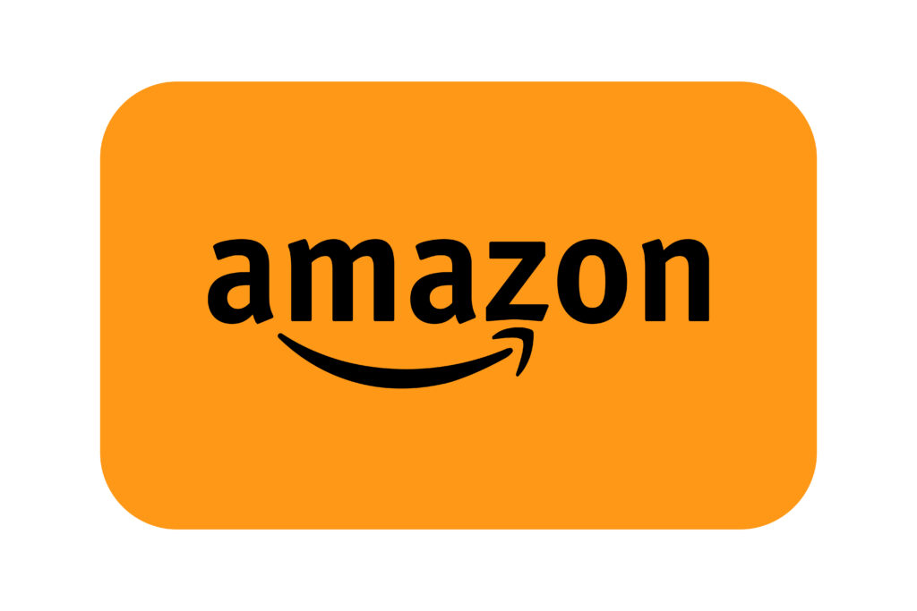
The current Amazon logo is designed in sleek black, visually conveying a smile through a curved arrow in yellow. Smile initiates with ‘A’ and ends on ‘Z’.
Each approach defines a meaning, where a smile represents customer satisfaction; on the other hand, the ‘A’ to ‘Z’ indicates the large product varieties.
People often want to learn how Amazon creates a logo that demonstrates loyalty, which they should consider for designing a legendary logo for their own brand.
To achieve this proficiency, you need to explore the Amazon logo history and evolution, which inspires you to create a long-term vision.
The Early Days: The First Amazon Logo

Before Amazon, the platform was recognized as “Cadabra”, which was founded by today’s well-known person, Jeff Bezos, in 1994.
However, the name was soon changed when the Amazon River reflected Bezos’s vision more extensively for his company.
The logo was a combination of a Large ‘A’ and, inside it, a river-like line was implemented.
The platform initiates its journey as a book purchasing platform. It was a great plan to provide people with knowledge that was not readily available on the internet at that time.
The job they are doing is reflected in their logo design, with a river-like arrow symbolizing both the vast range of books (from A to Z) and the company’s future ambitions to become a universal library of goods.
1997-1998: The Transition to a Simplified Look

As time passed, Amazon decided in 1997 to refine its logo in a more enhanced way.
The second version of the “Amazon” name introduces the proper domain name, “Amazon.com,” in bold font using sans-serif styling.
To demonstrate a totally new era of purchasing and selling through a website, they put a next-level detail in the large ‘A’ by adding waves into it.
The whole design reflected the company’s growing confidence, focusing on the brand name without additional imagery.
The clean and professional look begins to highlight Amazon’s seriousness about expanding its platform on a wide scale.
1998: Reached the UK & Germany

The Amazon logo history began changing in 1998, when they launched their logo as a decent domain with a quite curved underline, which resembles a river wave.
The enhancements occurred because Amazon began to flourish on a global level by reaching the UK and Germany.
Additionally, its list of products started jumping beyond boundaries; the platform was not only limited to books, but now also included entertaining products like Toys, DVDs, CDs, and Video Games, making it a more interesting option for the young generation.
2000-Present: The Birth of the Iconic Smile

The year 2000 marked the final major redesign of the Amazon company logo, which is recognized as the emblem logo of the present time.
Now, the style of domain names has evolved in a way that remains relevant in every era. Seek, black lowercase font, but the “.com” was dropped, yet now the name is not like a website; instead, it gives the essence of a global corporation.
From a decent line under the Amazon, it transformed into an arrow that curved in the shape of a smile, starting from ‘A’ and closing on ‘Z’.
In fact, the Amazon logo meaning also slightly evolved, where in the early days it represented the river by a curved symbol; now it has evolved into a smile.
Representing the commitment to customer support and satisfaction from the platform.
The Evolution Journey Of Inspiring Platform
From 1994 to 2025, Amazon’s journey has been a symbol of consistent growth and transformation.
The incredible journey not just highlights the company’s worldwide success but also Amazon logo evolution, which happened after dedicated hard work, when Amazon crossed its own barriers of innovation.
Amazon started as a bookstore and now owns the label of global leadership in e-commerce, cloud computing, and entertainment.
To become a pioneer of e-commerce business, this platform’s commitment, strategic vision, and countless innovations make it a standout example of growth and diversification.
Amazon proves:
“You can’t pretend greatness, it requires real work to achieve it.”
Special Tip to Shine Like Amazon:
Similar to Amazon, there are multiple businesses that are flourishing like Amazon but can’t effectively highlight the value they provide in their logo.
In this scenario, having an expert professional will solve your problem, whose artistic expertise makes your brand name attractive and thought-provoking in front of the world. Professionals like Vince Logo Design Firm.
Who are great in what they do. Even with a casual conversation with the client, our team understands the vision and priorities that the client wants to appear in the logo.
However, people can also design a logo by utilizing a third-party tool with the following easy steps, but the question is, can you represent your vision and priorities in your logo?
For a casual conversation, you can contact us, who knows? You are a click away from getting your own thought-provoking identity mark.
Conclusion: Amazon Logo Meaning
In today’s article, we discussed the history of well-spread e-commerce business. As time passed, the Amazon logo’s meaning improved slightly. In every professional emblem logo, there was a message, which was prominently visible.
Instead of being changed, they evolve their priority from a large digital book store to a scalable, wide-ranging digital store. Looking back at the Amazon logo history, we see a clear growth, adaptability, and strategic branding.
All enhancements in the logo not only showcase the design, vision, or a deep message but also describe the current goal that they are now working on.
Vince Logo Design is a distinguished digital marketing agency, specializing in crafting compelling brand identities and optimizing online presence. We are your partners in creating impactful digital strategies that drive results.
Get in touch.Articles
- Top 10 SEO Benefits of Responsive Web Design in 2025
- 8 Best CMS for Small Business in 2025: Pick the Popular
- 5 Best Hosting for Small Business Websites
- Affordable WordPress Website Design: Best Service Provider
- Custom Design Vs Template Website: Which One Is Best?
- Fix My WordPress Site: WSOD, Redirect & Site Maintenance
Get Free Consultancy
Fill the following form and receive a guaranteed response within 48 hours.


We have worked with world's leading brands