


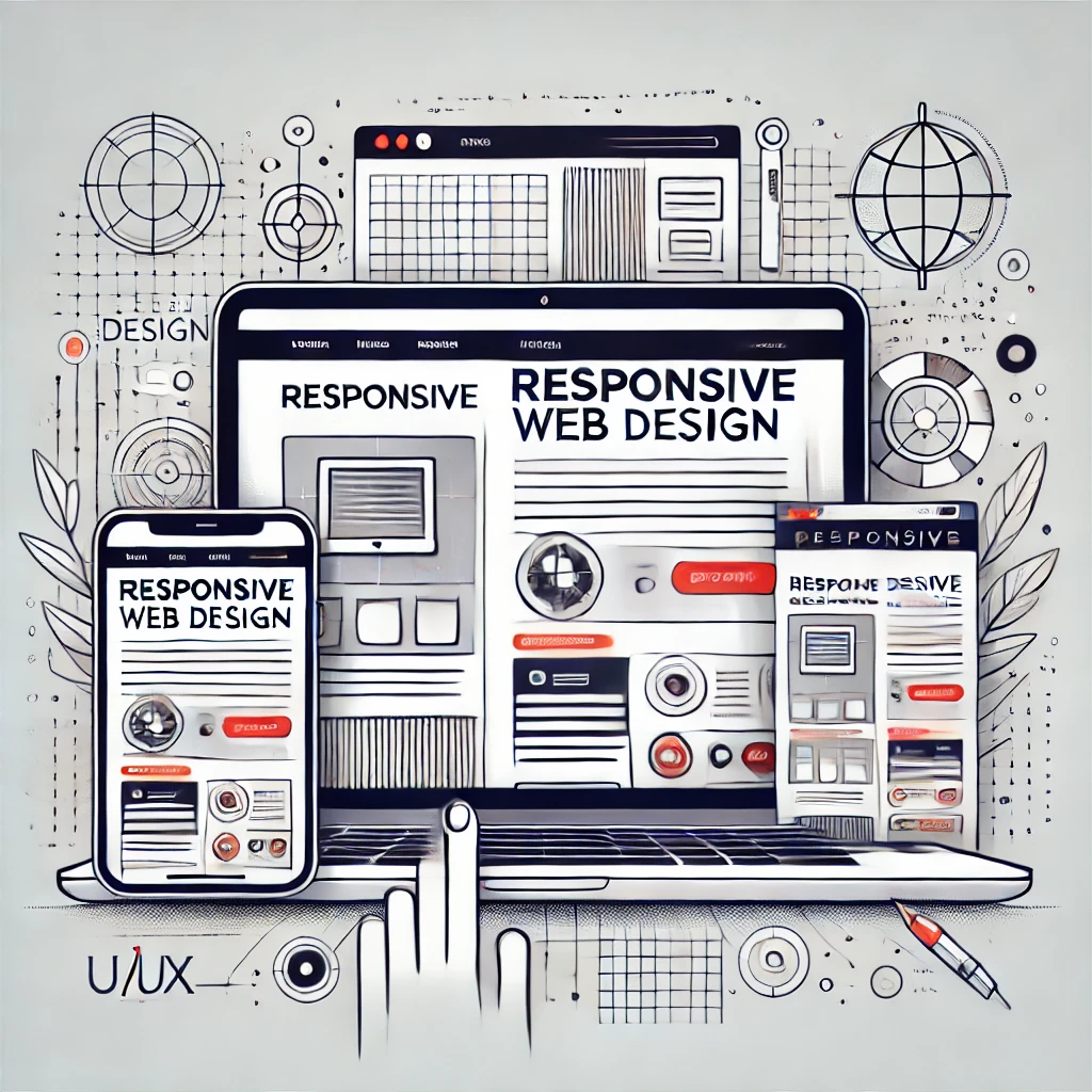
When a website flexibly transforms its layout on distinct screens and provides easy navigation, it is referred to as a responsive design.
But here is the Journal query:
Is Flexibility the Only Benefit, or Are There More Hidden Gems?
Undoubtedly, there is more to explore, from crucial, profitable gems to significant harmful consequences on the invested site.
This blog aims to answer your “What is Responsive Web Design” questions and raise awareness about how responsive design affects your site’s UI/UX, SEO, and conversion ratio.
Let’s find out what the purpose of responsive web design is.
What is Responsive Web Design? Understand on Pro Level:
RWD stands for responsive web design, which is one of the practices of front-end developers, whether they are a part of a professional firm or an individual freelancer.
They utilise this approach to construct a layout that ensures websites adjust smoothly to various screen sizes, resolutions, and devices.
However, there are multiple ways to approach building a responsive website:
- Flexible grids
- Fluid images
- Media queries
These are the measure techniques that limitlessly pursue and integrate on a web page’s each component/section.
It creates an environment that gives an appearance of alignment on the user’s device and eliminates the need for pinching, zooming, or horizontal scrolling.
The main goal of responsive design isn’t just a good-looking layout, it’s about giving users a secure, reliable, and easy-to-use experience.
Where a user navigate and utilize the site according to their preferences.
When Was the Responsive Design Concept Introduced?
The concept of responsive web design was first introduced by Ethan Marcotte in 2010.
As he introduced this theory, Ethan demonstrated its effectiveness by utilizing fluid grids, flexible images, and media queries to create websites that adapt to the user’s device.
“Need is the Mother of Invention”
This technique was explored during that time period when mobile internet usage was skyrocketing and developers were searching for a way to demonstrate their site on various screen sizes.
In 2025, the RWD is not bordered by a trend, instead, it jumps beyond.
Now this alignment is recognized as a demand from portfolio to professional business site owners.
Why Responsive Web Design Is Important?
So, what is the purpose of responsive web design?
Making a better UI and UX for possible screen sizes is the ultimate purpose of a responsive web page or whole website, yet the question’s answer does not end here.
Here are some key reasons that prove the cruciality of RWD:
- Improved User Experience: A responsive website design aims to enable users to smoothly navigate and interact with the website, regardless of their device.
- SEO Benefits: Search engines like Google prefer mobile-friendly websites over out-of-order. Sites that focus on the trio sides of display (Mobile, Tablet, Desktop) will rank efficiently.
- Cost-Effectiveness: Rather than building two separate websites for desktop and mobile platforms, RWD allows you to maintain a single site that works everywhere.
- Increased Conversion Rates: A smooth browsing experience resulted in higher engagement and better conversion rates. That can transform a visitor into a loyal customer.
A well-aligned site that gives us so many benefits, from representing brand values on every screen, global traffic, and even enabling customers to be loyal to us.
However, there is still a common doubt that exists in every wise owner’s mind:
Is There Any Hidden Cost?
Well, definitely there is a cost, which is labelled as Quality.
Quality is the requirement for every site, that can’t be compromise whatever its aim it builds on.
A responsive website is one of the crucial parts for the achievement.
But there is a lot to tackle to avail the benefits properly, like aligning the site as per On-page and Off-Page SEO tactics, integrating a professional Backend, and much more.
Now it sounds impossible!
Don’t worry, you can still make it. Just utilize the help of an expert who can enhance or recreate your site from scratch.
But if you have trust issues about people’s authenticity, it is recommended to approach a dedicated company.
Choose them by their authorised and positive reputation.
Offering a portfolio and affordable prices, as Vince Logo Design firm does, are the ideal aspects that help you make clear and planned decisions.
Whether you pick Vince or someone else, ensure that you identify the level of professionalism.
What Are the Simple Ways to Make a Site Responsive?

Whether you’re a beginner or an experienced coder for making a site responsive, there are three approaches that need to be mastered to this skill:
Flexible Grids A.K.A Fluid Grids:
These use relative units (%, em, and rem) instead of just fixed units, pixels, to create flexible layouts. It utilizes by assigning the column size with a specific value, like:
grid-template-columns: 25% 50% 25%;
Flexible Images:
Images are scaled to fit within their parent containers, rather than sticking to a fixed pixel size. Code an image in a way that the desktop might overflow or get cut off on smaller screens, like:
img {
max-width: 100%;
height: auto;
}
Media Queries:
The media queries are the most effective approach for enhancing a website layout as per each screen size.
They offer conditional CSS rules that apply different styles depending on the device’s screen size, resolution, or orientation (landscape or portrait).
Here is a prototype of media query usage in coding:
/* Default for mobile */
.button {
font-size: 14px;
padding: 8px 12px;
}
/* Tablet and above */
@media (min-width: 768px) {
.button {
font-size: 16px;
padding: 10px 20px;
}
}
/* Desktop and above */
@media (min-width: 1024px) {
.button {
font-size: 18px;
padding: 12px 24px;
}
}
By combining these elements, developers can create appealing websites that function beautifully on any device.
Which Component Should You Focus on When Creating a Responsive Site?
For building a truly responsive website, you need to focus on the following elements:
- Navigation: Menus should be easy to use on the trio screen sides from the Desktop, Tablet, and Mobile sides.
- Typography: Text should be appropriately sized and auto-customizable for all devices.
- Performance: Optimize images and code to ensure fast loading times.
- Touch-Friendly Design: Buttons and links must be easy to tap on mobile devices.
FAQ Section:
What Is the Responsive Website Recognised for in Seo?
Google prioritised responsive websites. That’s why Google Core Web Vitals puts pressure on adhering to the protocols of making a site’s content flexible, because the more the site runs smoothly on different devices, the more users stay on the site, which is effective for ranking.
What Is Ui and Ux Design?
UI(User Interface) refers to what a user sees in your site and how it looks, including buttons, colors, layouts, and much more. However, the UX (User Experience) defines the emotions that a user feels for a site, such as whether it is easy to navigate, smooth, and fast.
What Is the Difference Between Responsive and Adaptive Design?
A responsive design can automatically adjust to any screen size, like water in a glass, but the Adaptive design switches between a set of fixed layouts depending on the device. One’s fluid, the other’s more “preset.”
Which Component Should You Focus on When Creating a Responsive Site?
For designing, go for Figma or Adobe XD for design, but to make it dynamic, ensure to use Visual Studio Code for coding. You can use frameworks like Bootstrap or Tailwind CSS to make the coding journey smooth.
Conclusion:
Today’s article is enough to prove that responsive web design isn’t just a nice-to-have ability anymore.
It has now evolved into the backbone of a successful online presence.
From making your site look stunning on every device to boosting SEO, cutting costs, and keeping visitors engaged, RWD is an investment that gives you a return on every click.
So, whether you roll up your sleeves and make the decision to craft the site by yourself or approach a trusted professional to do it for you, consider responsiveness as your top priority.
Because in 2025 and beyond, the sites that thrive will be the ones ready for every screen, every user, and every opportunity.
Vince Logo Design is a distinguished digital marketing agency, specializing in crafting compelling brand identities and optimizing online presence. We are your partners in creating impactful digital strategies that drive results.
Get in touch.Articles
- Top 10 SEO Benefits of Responsive Web Design in 2025
- 8 Best CMS for Small Business in 2025: Pick the Popular
- 5 Best Hosting for Small Business Websites
- Affordable WordPress Website Design: Best Service Provider
- Custom Design Vs Template Website: Which One Is Best?
- Fix My WordPress Site: WSOD, Redirect & Site Maintenance
Get Free Consultancy
Fill the following form and receive a guaranteed response within 48 hours.


We have worked with world's leading brands