


We’ve experienced a timeline from flipping through books to browsing on digital screens. As times change, so do our devices, from desktops to tablets, and now we are on smartphones.
Today, we’re in a new era.
Where smartphones are not limited to typical mobile phone activities, they now allow you to explore the world through websites with just a single tap.
As more users are browsing on smartphones, the importance of responsive web design going far beyond.
A good responsive design is not only enough to just look good on every screen, but it is now playing a key role in ranking your site on Google.
Today, we will explore the top 10 SEO benefits of responsive web design that developers and website owners should consider to align their website with it.
SEO Benefits of Responsive Web Design in 2025
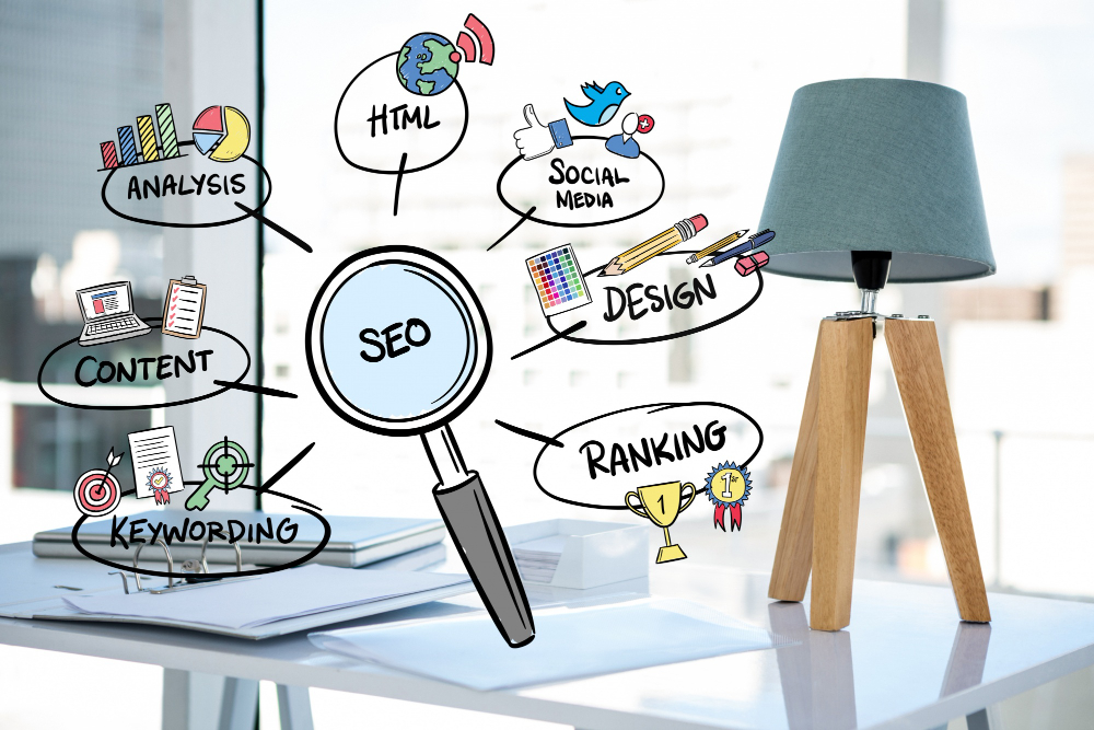
There are 10 responsive web design and seo steps that need to be adhered to. As a dedicated web development and design firm, we also follow these protocols to enhance our and our clients’ websites.
Beneficial for SEO:
- Improved Mobile-First Indexing
- Lower Bounce Rates & Longer Dwell Time
- Consolidated SEO Efforts (Single URL)
- Faster Page Load Speeds
- Enhanced Crawl Efficiency
- Higher Social Sharing Engagement
- Improved Local SEO Performance4
- Better User Experience (UX) = Better SEO
- Reduced Maintenance = More SEO Focus
- Future-Proofing Your SEO Strategy
Now that you have a surface idea, your next step is to focus on responsive website SEO. The real question is, how will you proceed?
As you scroll this page, you’ll find each point’s usage and a following guide.
Importance of Responsive Web Design: Approaches for Effective Mobile SEO
1. Improved Mobile-First Indexing:
As the website’s usage rate increases on the mobile side, Google is now giving priority to web design responsiveness, meaning “how your website looks on mobile“.
Making a responsive web design highlights the practice of flexible and structured content that will fit on every screen and run smoothly, whether it’s a desktop, tablet, or mobile phone.
A beneficial act to help you boost your chances of showing up higher in search results.
2. Lower Bounce Rates & Longer Dwell Time:
The bounce rate increases due to an unstructured layout and moving content. It decreases in that case, when users land on a site that works well across all devices, this situation holds them for a longer time to stay, explore, and engage.
These are the signals for search engines to judge your website and its content quality, and this is one of the biggest SEO benefits of responsive web design.
It is a fact that a smooth, mobile-friendly experience keeps visitors around longer and reduces the chance they’ll bounce right away.
3. Consolidated SEO Efforts (Single URL for All Devices):
A major reason why responsive web design is good for SEO is that it is effective in eliminating the need for separate URLs for desktop and mobile versions.
With just one URL and a unified set of HTML/CSS, your site avoids duplicate content issues, strengthens backlink equity, and simplifies site management, which efficiently makes your overall SEO strategy more impactful.
4. Faster Page Load Speeds:
While judging the website, search engines usually focus on site speed, like how fast the page is loading, especially on the mobile side, which is one of the crucial factors in ranking.
Since responsive websites are typically more efficient and built with performance in mind, they load faster across all devices.
This faster performance demonstrates an incredible user experience that directly supports the SEO benefits of responsive web design, helping your site to meet Google’s Core Web Vitals and rank higher in search results.
5. Enhanced Crawl Efficiency:
Search engines crawl those sites instantly that are as per their protocols, like adhering to the rules of Google Core Web Vitals, such as having an easy-to-navigate site with a flexible layout across all devices.
However, no multiple URLs and complex redirects are a plus for a site, which makes it ideal in view of bots that would like to crawl fast in the list.
In simple words, these practices will lead to indexing more accurately and improving your responsive website SEO performance in search rankings.
6. Higher Social Sharing Engagement:
Often users come from social media apps by shared links, implementing a responsive design allows travellers/users to easily navigate, engage, and re-share your site to others.
This act increases social interaction and drives traffic as well, which represents a sign of an interesting website for users and bots.
7. Improved Local SEO Performance:
As the mobile industry experienced a boom in usage, the ‘near-me’ and other location-based searches dominate the search intent.
This becomes a profitable opportunity for those businesses that offer local services like Food shops, groceries, and many more.
For promoting the business, make sure your site is responsive, so that the business is properly displayed in mobile search results and maps.
Whatever the site, if it is technically optimized, the responsiveness supports its visibility, and this is the reason small companies locally become big enterprises by understanding the importance of responsive web design.
8. Better User Experience (UX) = Better SEO:
Users give priority to fast, easy, and visually clear navigation across all devices.
As per these requirements, a website construct that meets these expectations and provides a responsive design, flexible layout, and functionality, whether on phone, tablet, or desktop.
Since Google emphasizes user experience as a ranking factor, responsive web design and SEO are closely connected and generate a better UX, which leads to ideal search engine performance.
9. Reduced Maintenance = More Time for SEO Optimization:
Maintaining separate mobile, tablet, and desktop versions can be time-consuming and inefficient.
Mostly developers reduce technical overhead by making a responsive web design, which frees up valuable time to improve content, audits, and implement strategic improvements.
One of the key SEO benefits of responsive web design is the ability to invest more energy in actual optimization tasks.
10. Future-Proofing Your SEO Strategy:
As the laptop and desktop screens are replaced by a smartphone, be ready for a more creative screen like Foldable, Wearable, and more smart screens.
Your site needs to remain accessible and functional for all.
Always prepare yourself and skills to make a responsive web design that ensures adaptability across emerging, evolving devices.
Instead of constant redesigns, your site must be ready to search across platforms.
This makes responsive design a smart move for future-proofing your SEO strategy and maintaining visibility for the long run.
Is There a Quick and Easy Way to Make Your Website SEO-Ready Across All Devices?
Yes, there is a way.
Often, people want that instead of investing their time in understanding responsive web design and seo, why not find a professional who is already aware of them and an expert in resolving technical issues.
In this situation, there are millions of experts who claim their expertise, but how are you gonna address them, whether they are authorized or not?
In proving the authenticity, there are some important aspects like extensive years of experience in the field, a good portfolio, open representation of services, and much more.
However, the Vince logo Design firm is one of those companies that follow these and other aspects at affordable prices.
If you are a quick solution seeker, start a conversation with a design expert, whether it’s Vince or any other dedicated expert.
FAQ Section:
How does responsive design impact page speed and SEO?
Responsive design contains aligned and important content, usually for mobile and tablet screens. The animation functionality is eliminated by developers, which decreases the extra code burden, and the site instantly loads with crucial images, content, and structure. In fact, a higher ranking in SEO is the reward of faster loading.
Should I use a single URL for all devices in my SEO strategy?
Yes. Because a single URL across all devices in responsive design leads to avoiding duplicate content, simplifying indexing, and helps consolidate link equity. All support a stronger SEO performance.
How do wearable and foldable devices affect responsive SEO?
If content is accessed by a foldable mobile or high-tech glasses and your platform enables the display of content with an appropriate structure, this leads to the effect of responsive SEO, which increases your site’s bounce rate.
Do I need responsive web design to rank higher on Google?
Yes, Google prioritizes mobile-friendly content and layout. A responsive site ensures flexibility and better SEO results across all devices.
Conclusion:
In today’s article, we discussed the 10 seo benefits of responsive web design, which assist your site to get a rank in search engines.
Remember that responsive web design has evolved from a trend and transformed into a foundation for SEO success.
From improved UX to better mobile rankings and future-proof adaptability, its benefits directly impact your visibility and performance.
The simple way to rank your site is to start designing it for people, the search engines automatically consider it as recommendable.
Vince Logo Design is a distinguished digital marketing agency, specializing in crafting compelling brand identities and optimizing online presence. We are your partners in creating impactful digital strategies that drive results.
Get in touch.Articles
- Top 10 SEO Benefits of Responsive Web Design in 2025
- 8 Best CMS for Small Business in 2025: Pick the Popular
- 5 Best Hosting for Small Business Websites
- Affordable WordPress Website Design: Best Service Provider
- Custom Design Vs Template Website: Which One Is Best?
- Fix My WordPress Site: WSOD, Redirect & Site Maintenance
Get Free Consultancy
Fill the following form and receive a guaranteed response within 48 hours.


We have worked with world's leading brands